Vitrum Global Con Design – Where Vision Meets Impact
Client: Vitrum Global Con | Role: Lead Brand Designer & Visual Strategist
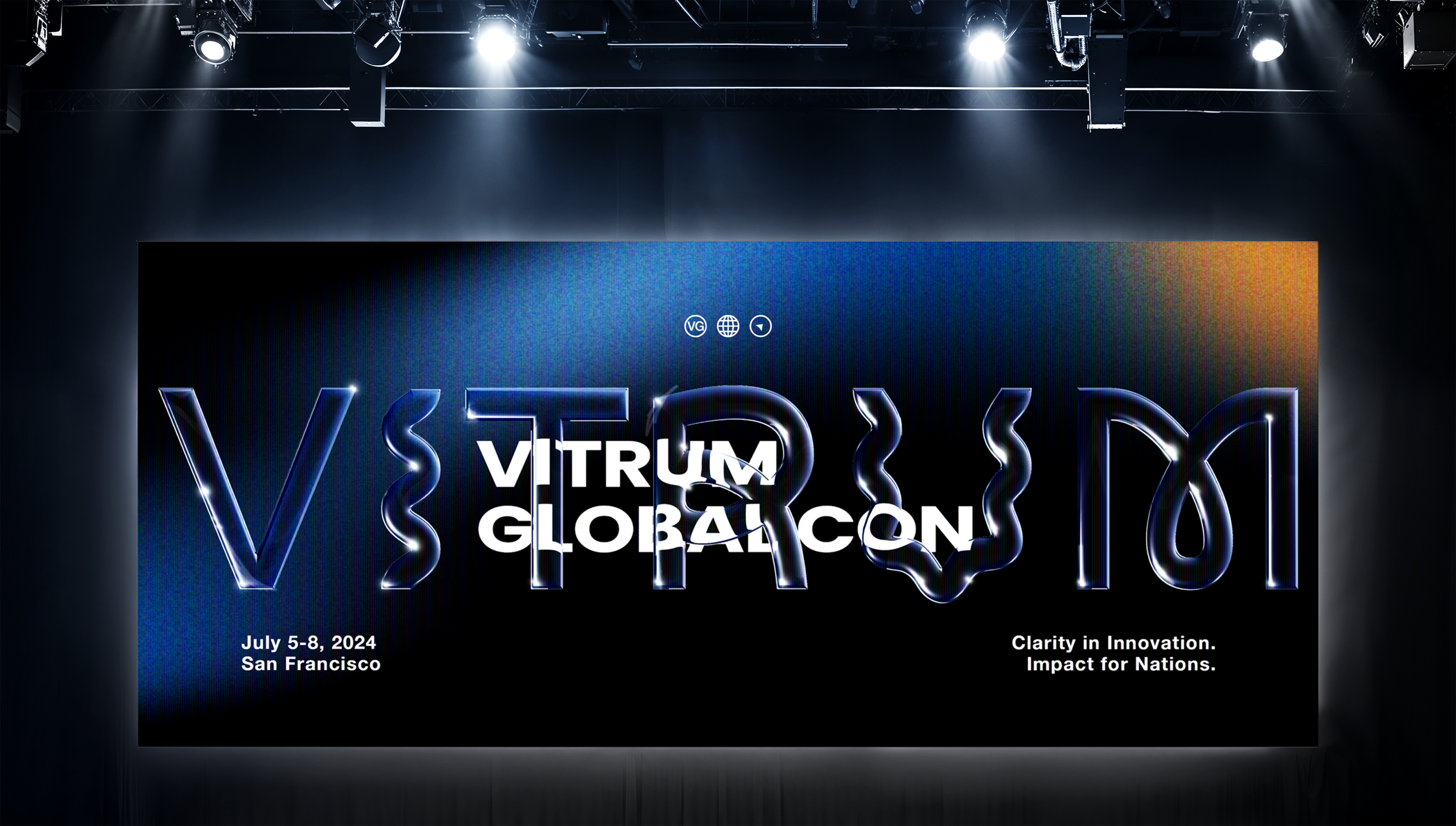
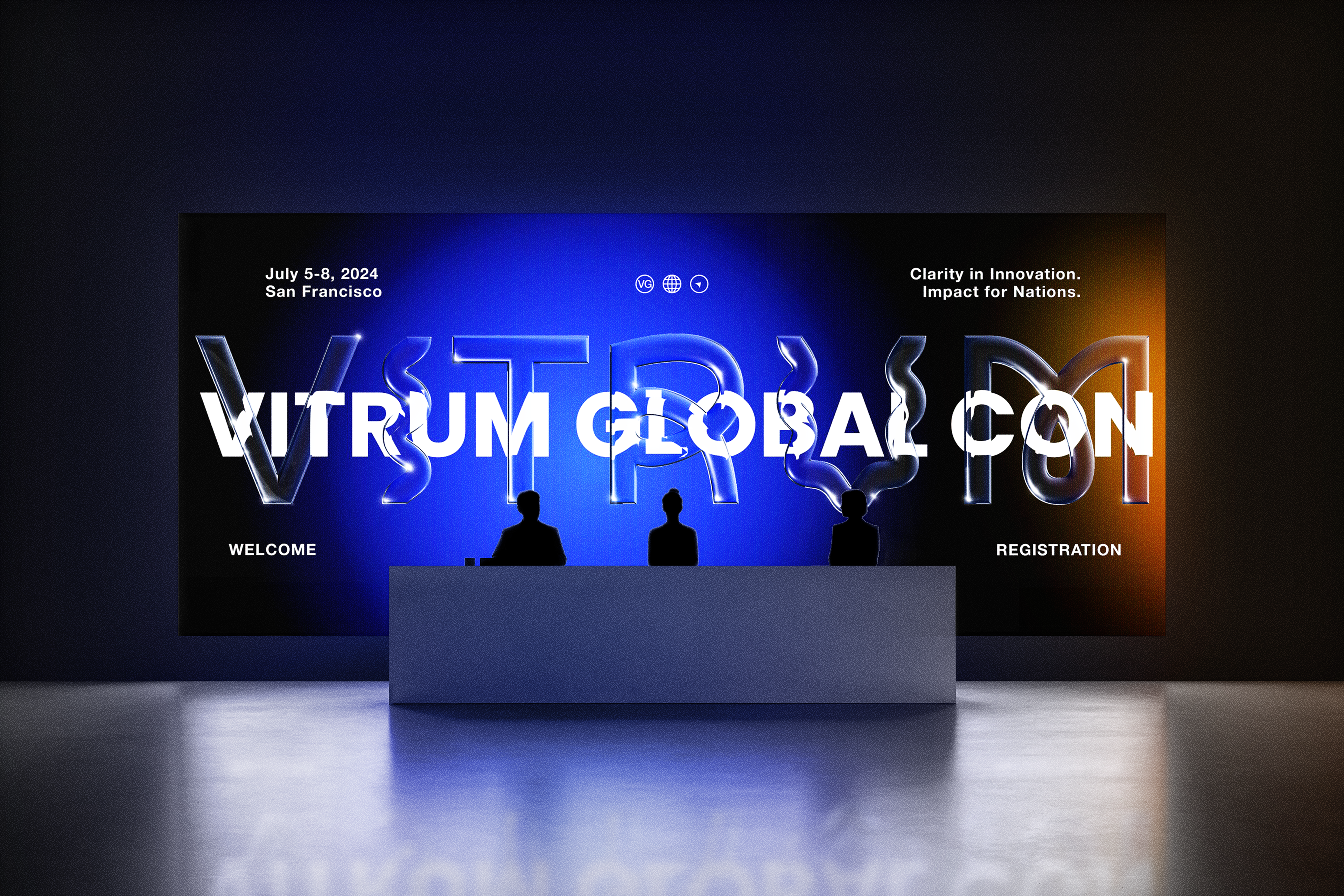
Vitrum Global Con 2024 is an international conference bringing together global leaders in technology, business, medicine, and education to drive scalable, purpose-driven innovation for global development. The name Vitrum—Latin for “glass”—became the conceptual foundation for a brand identity built around clarity, reflection, and forward vision. The design aimed to support cross-sector collaboration and inspire solutions to urgent global needs, especially in underserved regions.
Design Challenge: Create a unified brand system that communicates transparency, alignment, and innovation, while resonating across disciplines—from engineers and entrepreneurs to educators and medical professionals.
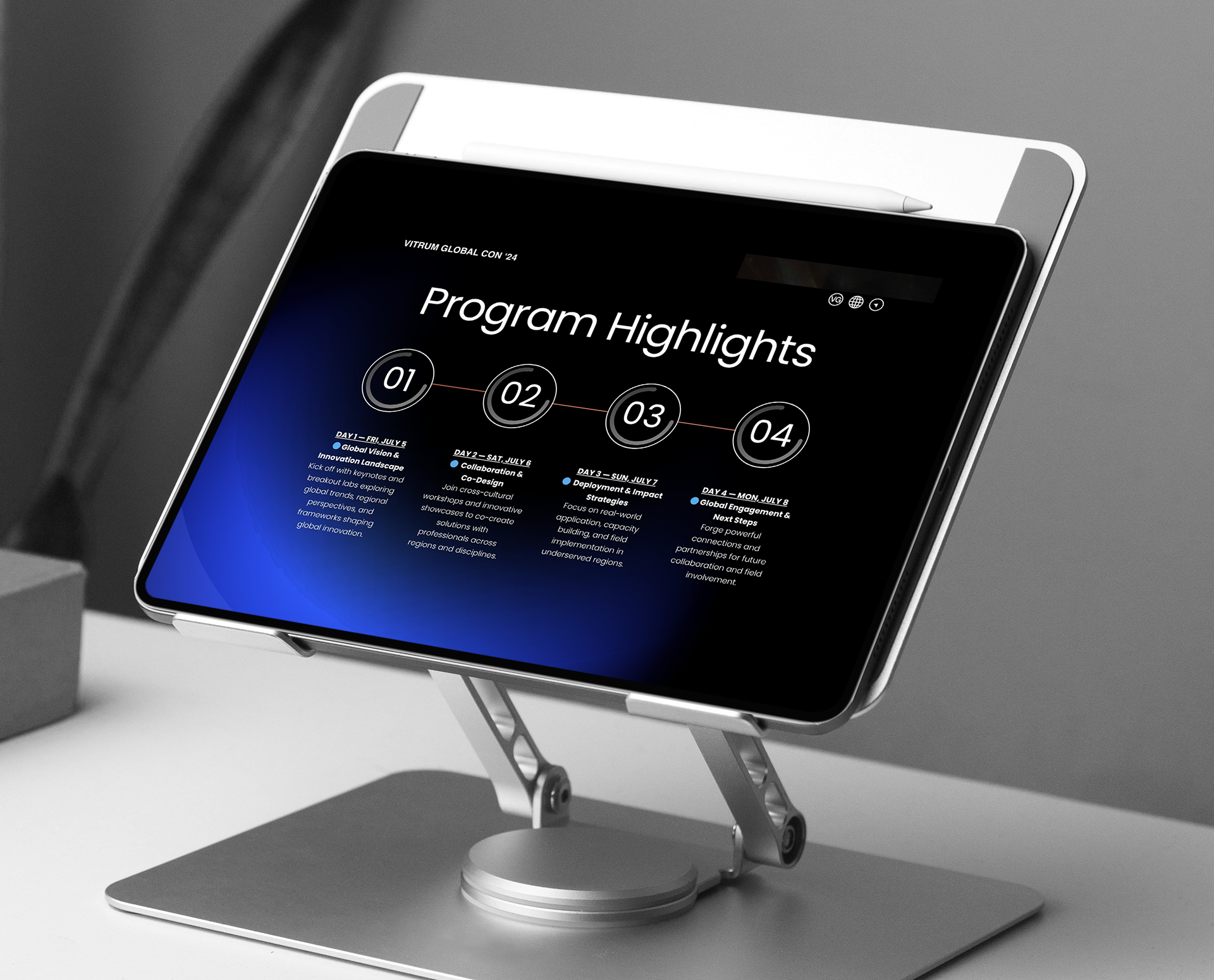
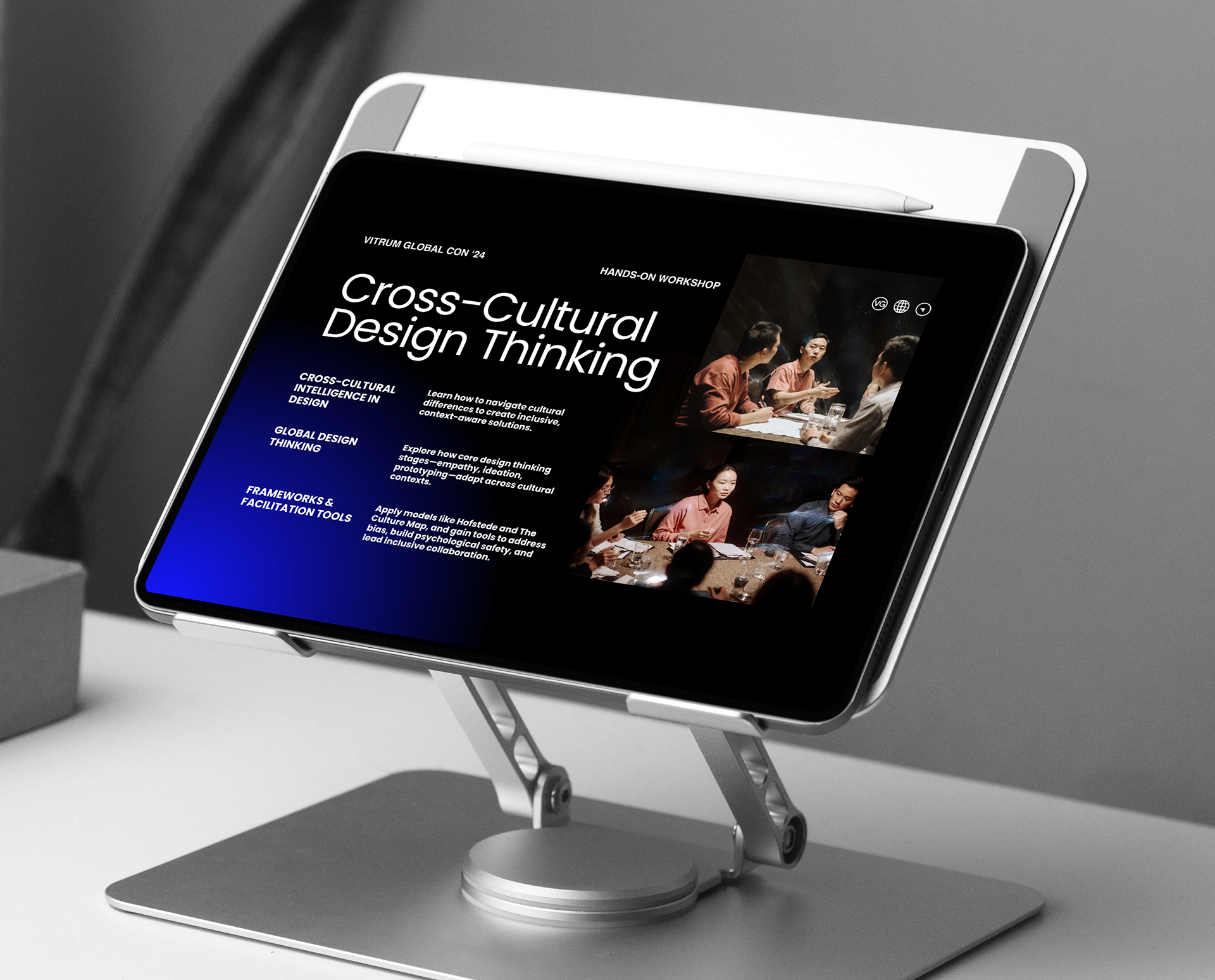
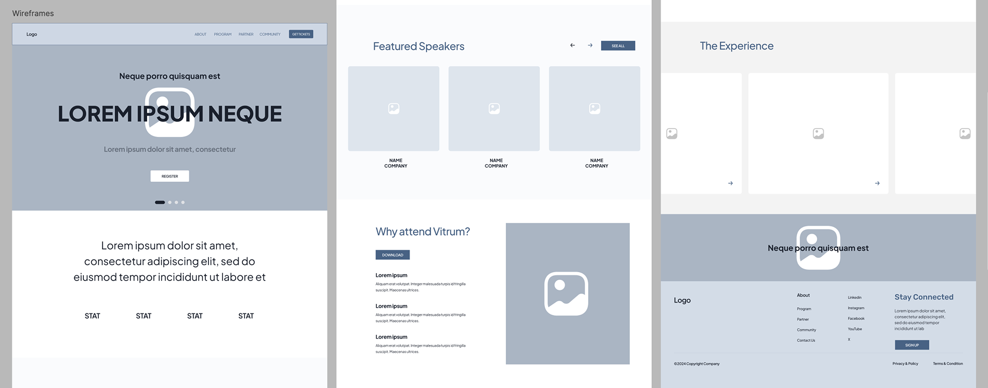
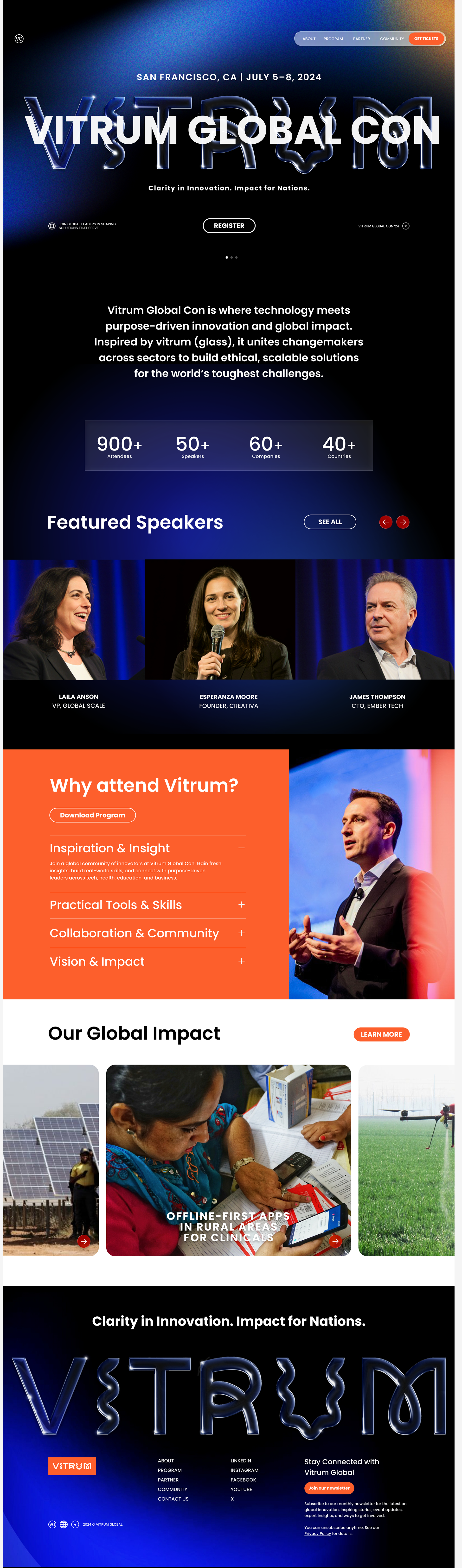
As the lead designer, I was responsible for creating the full brand identity and design strategy. I developed a cohesive visual system that translated across print, digital, and environmental formats—designing key assets such as pitch decks, session materials, programs, UI/UX, and web design. My focus was on crafting an adaptable design language that could serve multiple touchpoints while remaining rooted in the conference’s core values of clarity, innovation, and global impact.
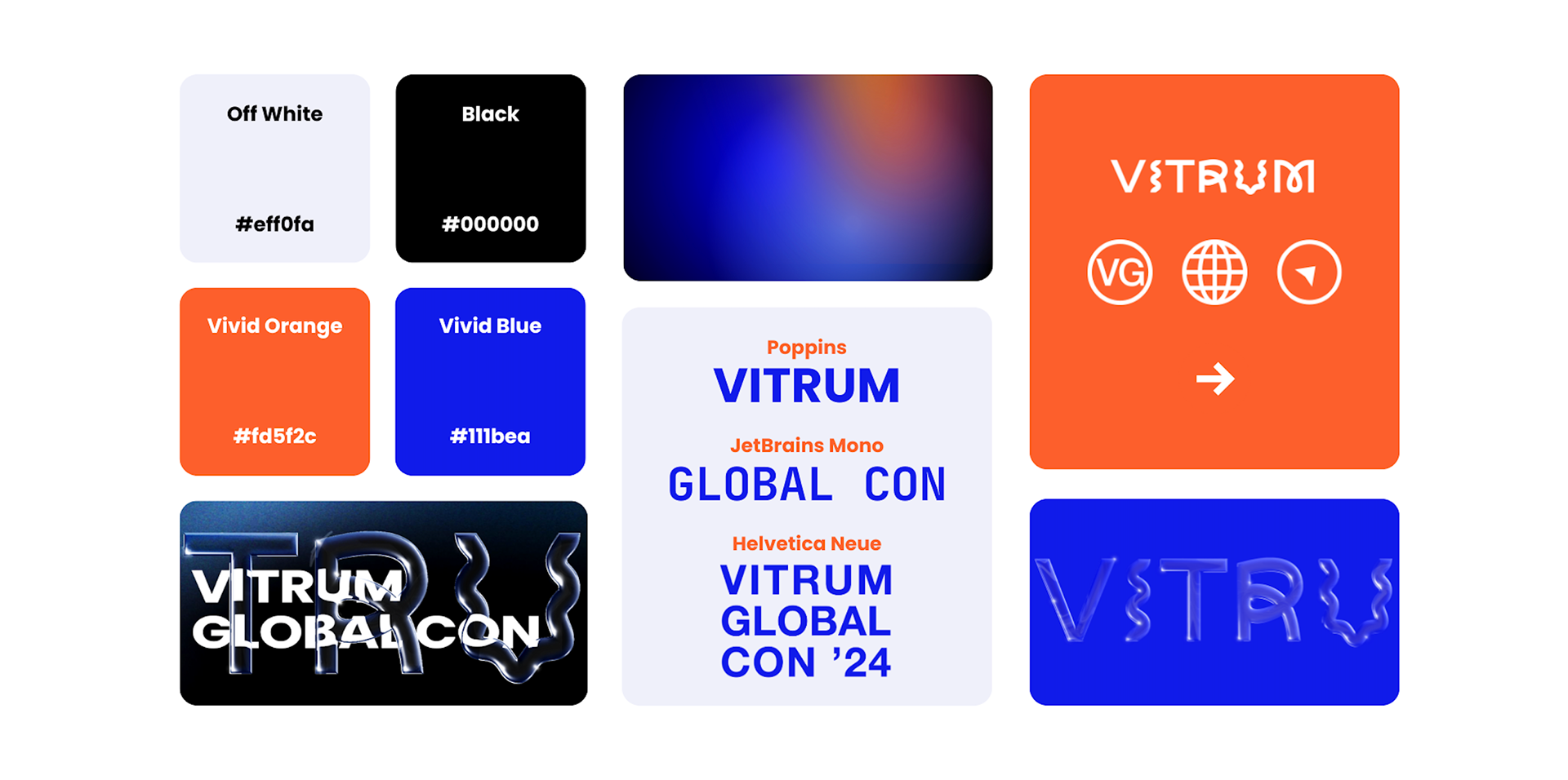
VISUAL STRATEGY & CONCEPT
The design concept centered around the material qualities of glass—symbolizing insight, openness, and global perspective. I explored:
Transparency: Layered gradients and semi-opaque elements to create depth
Structure: Grid systems inspired by architecture and interconnection
Light & Refraction: Soft glows and clean reflections to emphasize movement and transformation
Global Reach: Circular and faceted elements referencing both the globe and prisms of impact
DESIGN HIGHLIGHTS
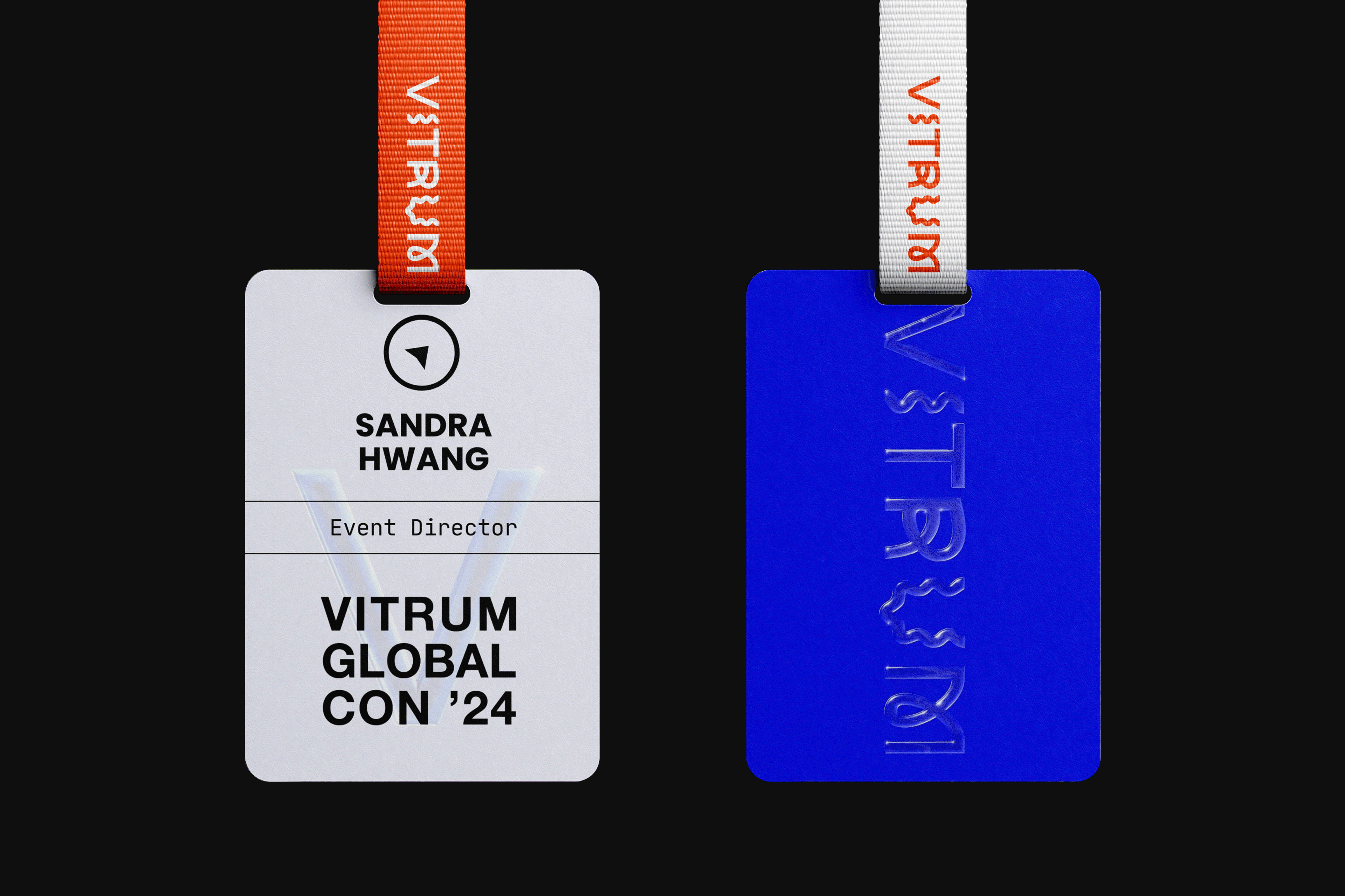
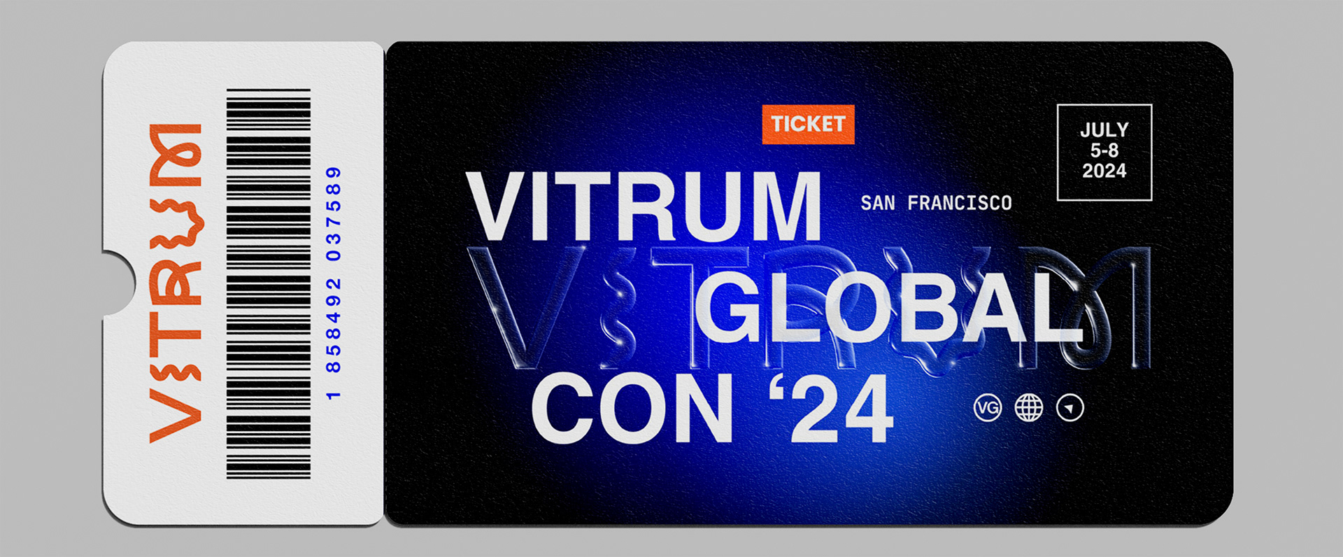
The brand identity featured a logo, color palette, and typography reflecting modern clarity and global elegance. This design extended to print materials like booklets and badges, digital assets such as presentation decks and social media graphics, and environmental elements including signage and conference space visuals.
IMPACT
Unified cross-sector audience: By visually uniting technology, business, and social innovation under a cohesive brand, it fostered a sense of openness and collaboration. Attendees reported feeling more connected and engaged, empowered to share ideas and work together toward impactful, real-world solutions.
Strong thematic cohesion: Every touchpoint reinforced the conference’s core message: innovation with clarity and purpose
Clarity: The design’s clarity and elegance reinforced the conference’s mission, making complex global challenges feel approachable and actionable.
Inspired action: The visual language helped spark dialogue and drive connection among attendees working to solve real-world challenges