DEVELOPING AN IMMERSIVE MUSEUM EXPERIENCE
Client: San Francisco Museum of Modern Art (SFMoMA)
Role: UI/UX Designer
Role: UI/UX Designer
My design team set out to design an integrated mobile, tablet, and kiosk experience for the SFMoMA to enrich how visitors engage with art, spaces, and each other. Our goal was to merge technology with storytelling—creating an app that enhances exploration while embodying the museum’s creative identity.
Design Challenges: Initial visitor feedback and on-site observation revealed key pain points: wayfinding confusion, limited access to contextual information, and a lack of personalized engagement. Visitors often missed out on deeper layers of meaning behind exhibits due to time constraints or fatigue. We also found that the digital tools available were fragmented and lacked cohesion.
DESIGN SOLUTIONS
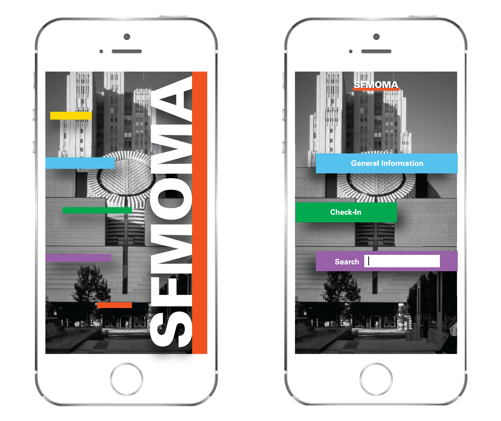
We crafted a clean, modern UI inspired by the museum’s architecture—using bold type, minimal color palettes, and grid-based layouts to echo the space’s structural clarity. The app and kiosk interface shared a unified visual system with:
We crafted a clean, modern UI inspired by the museum’s architecture—using bold type, minimal color palettes, and grid-based layouts to echo the space’s structural clarity. The app and kiosk interface shared a unified visual system with:
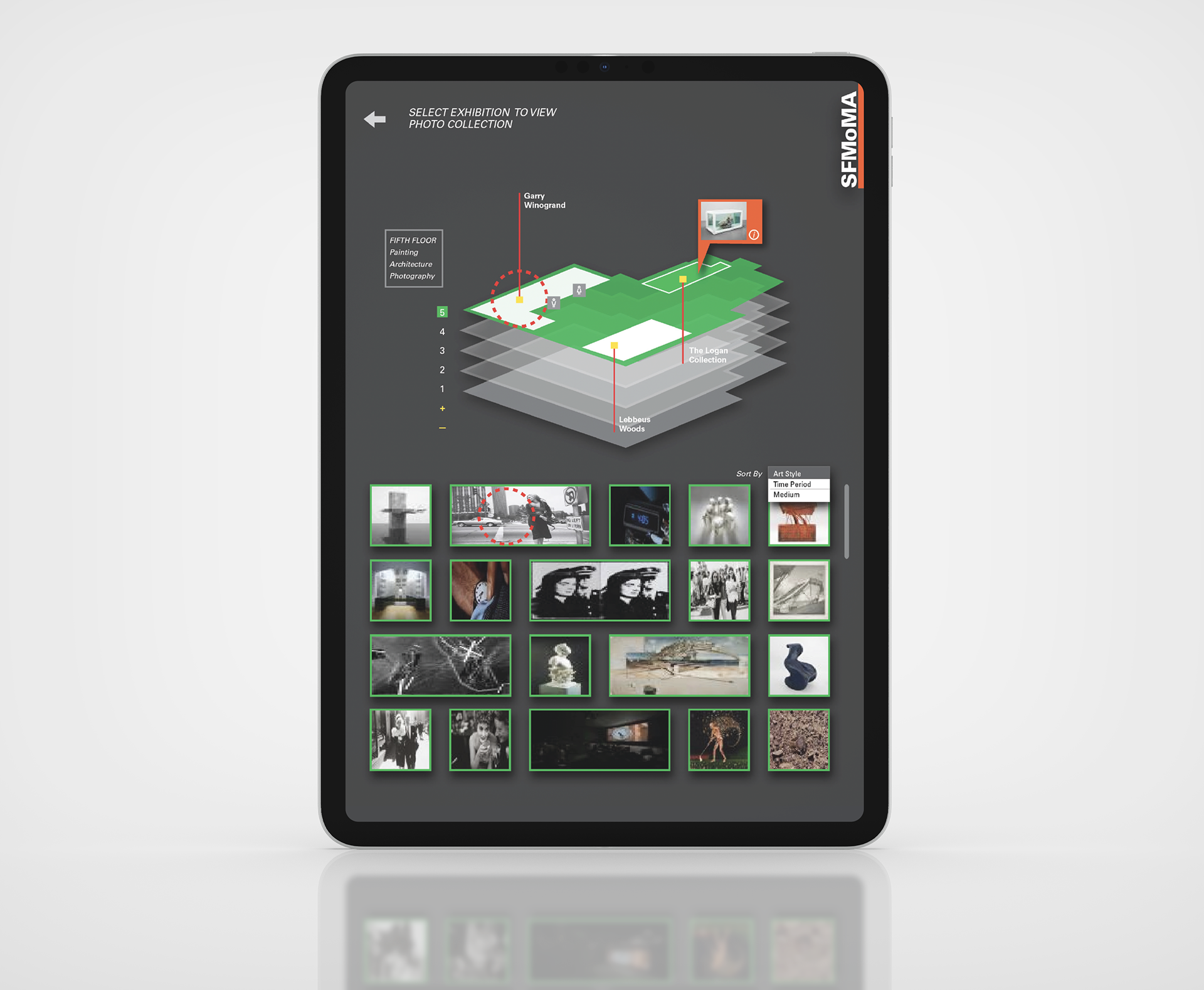
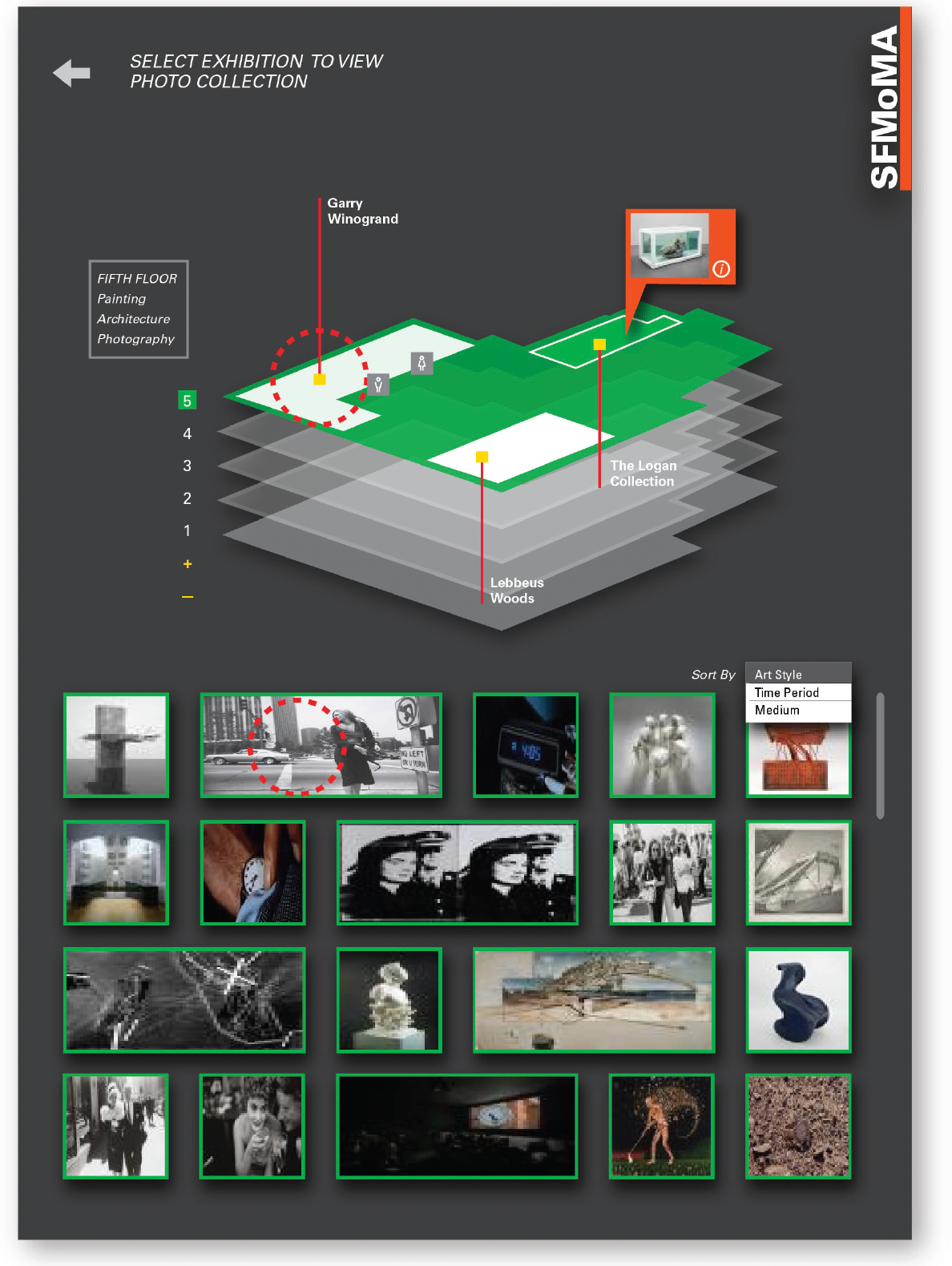
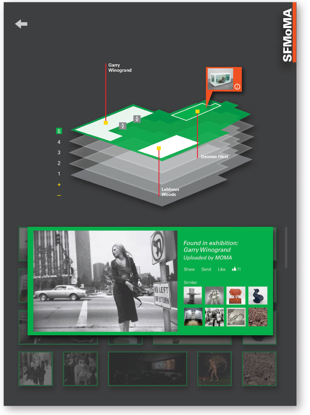
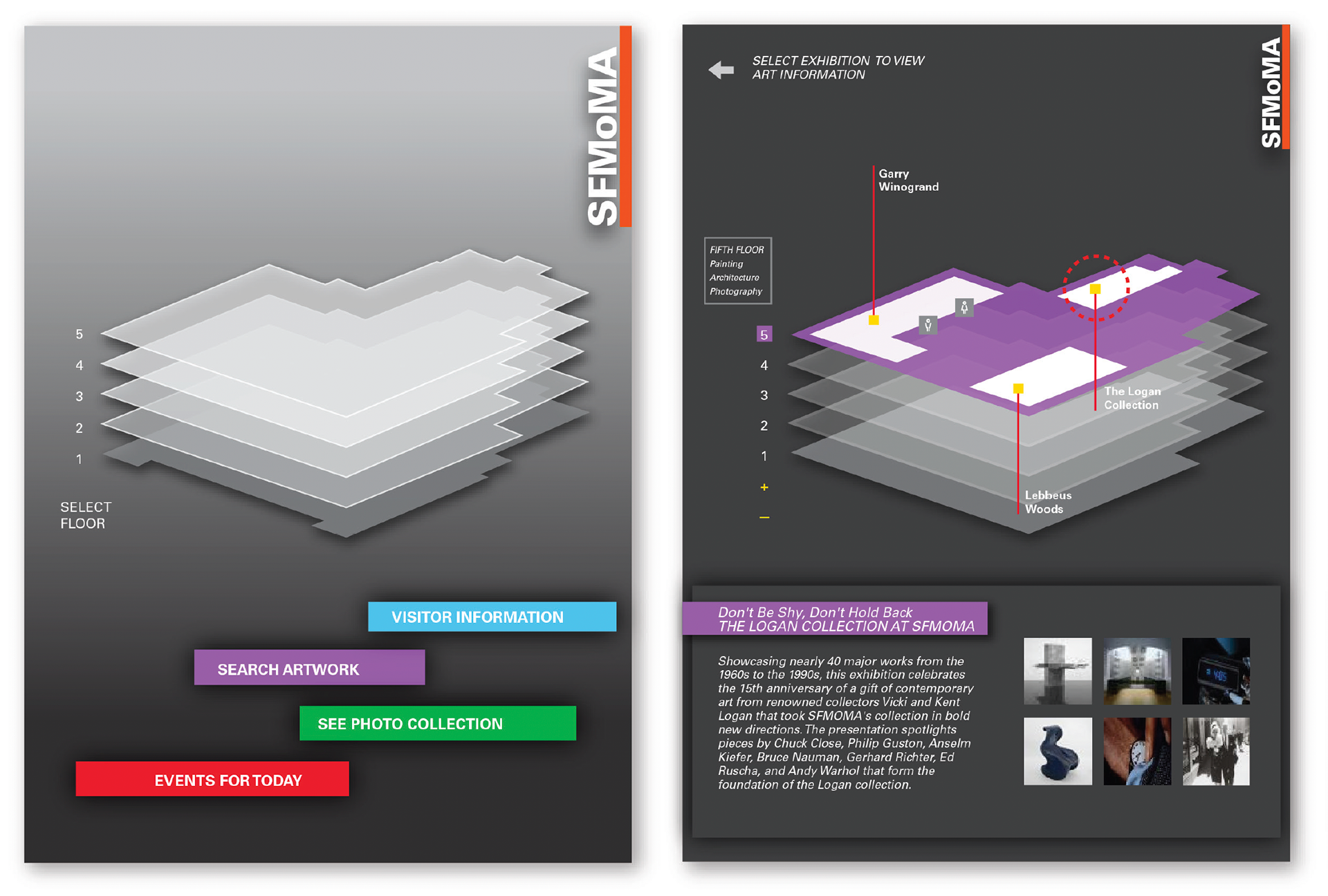
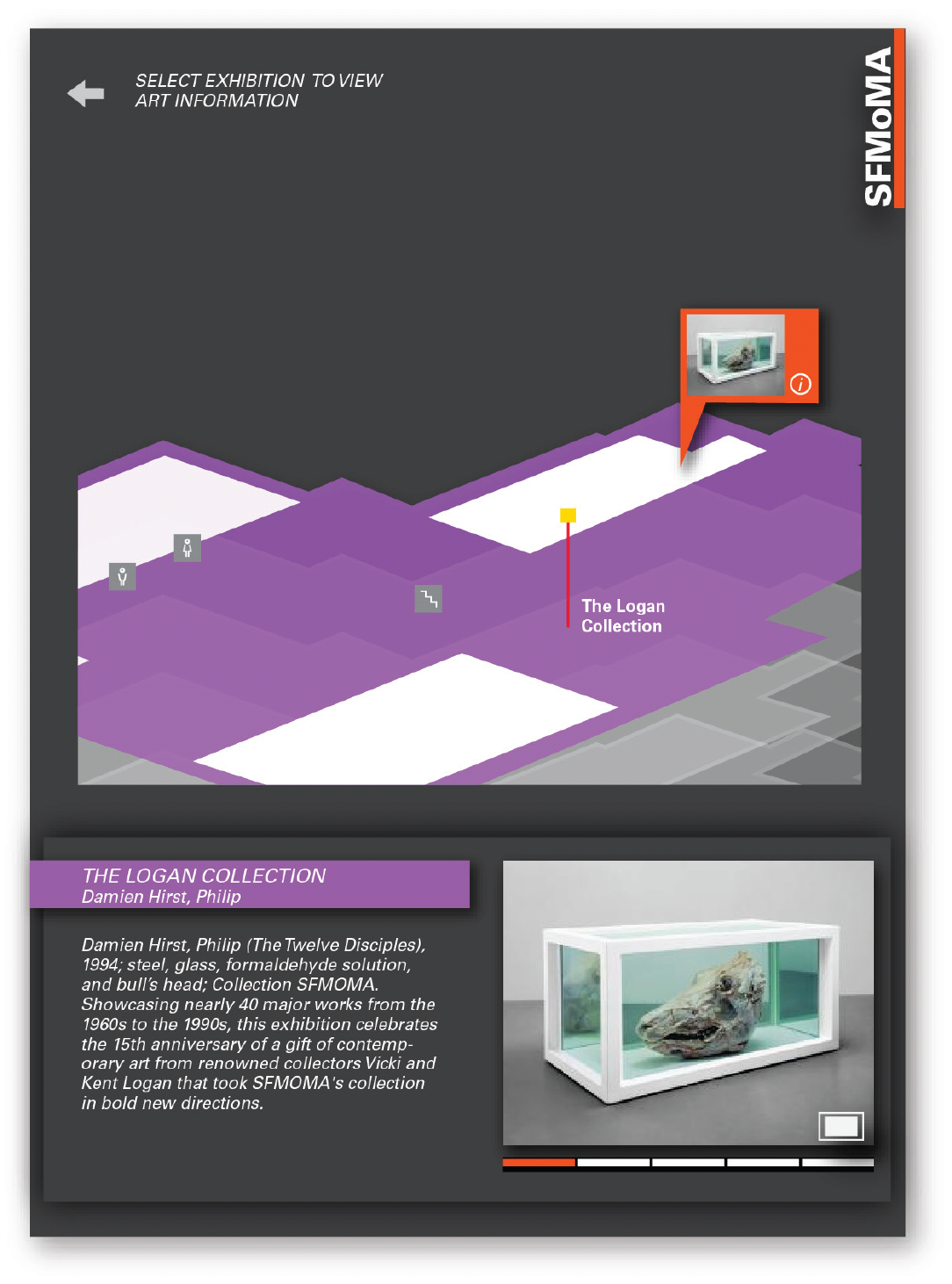
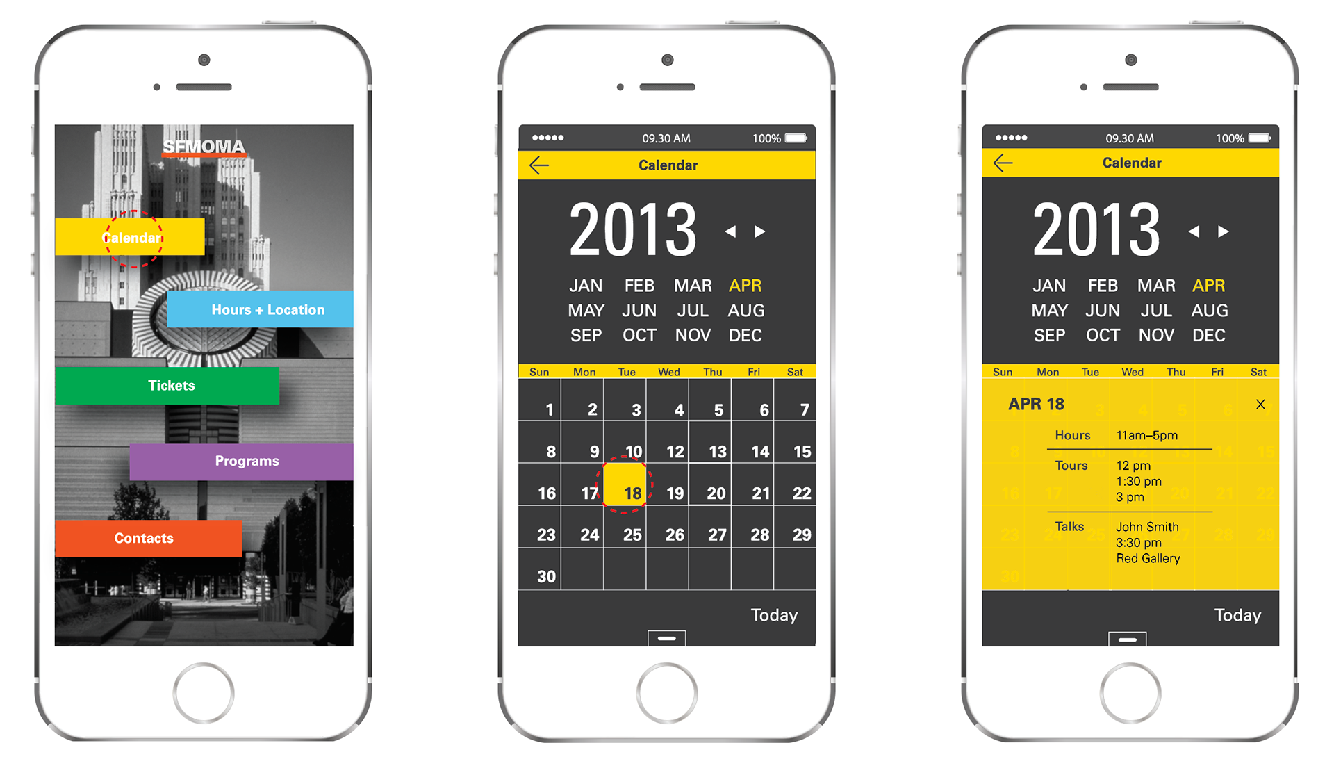
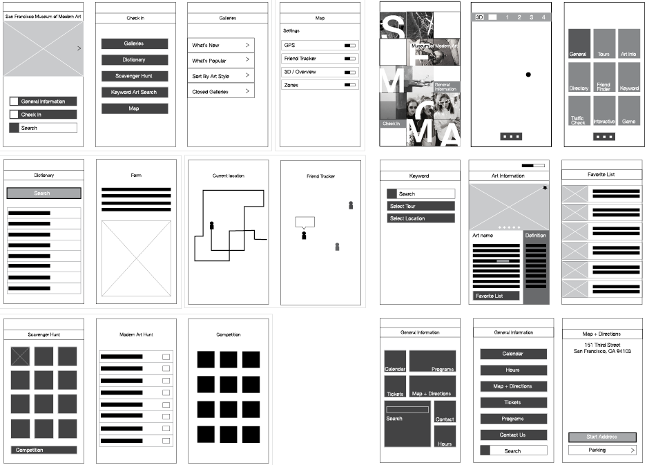
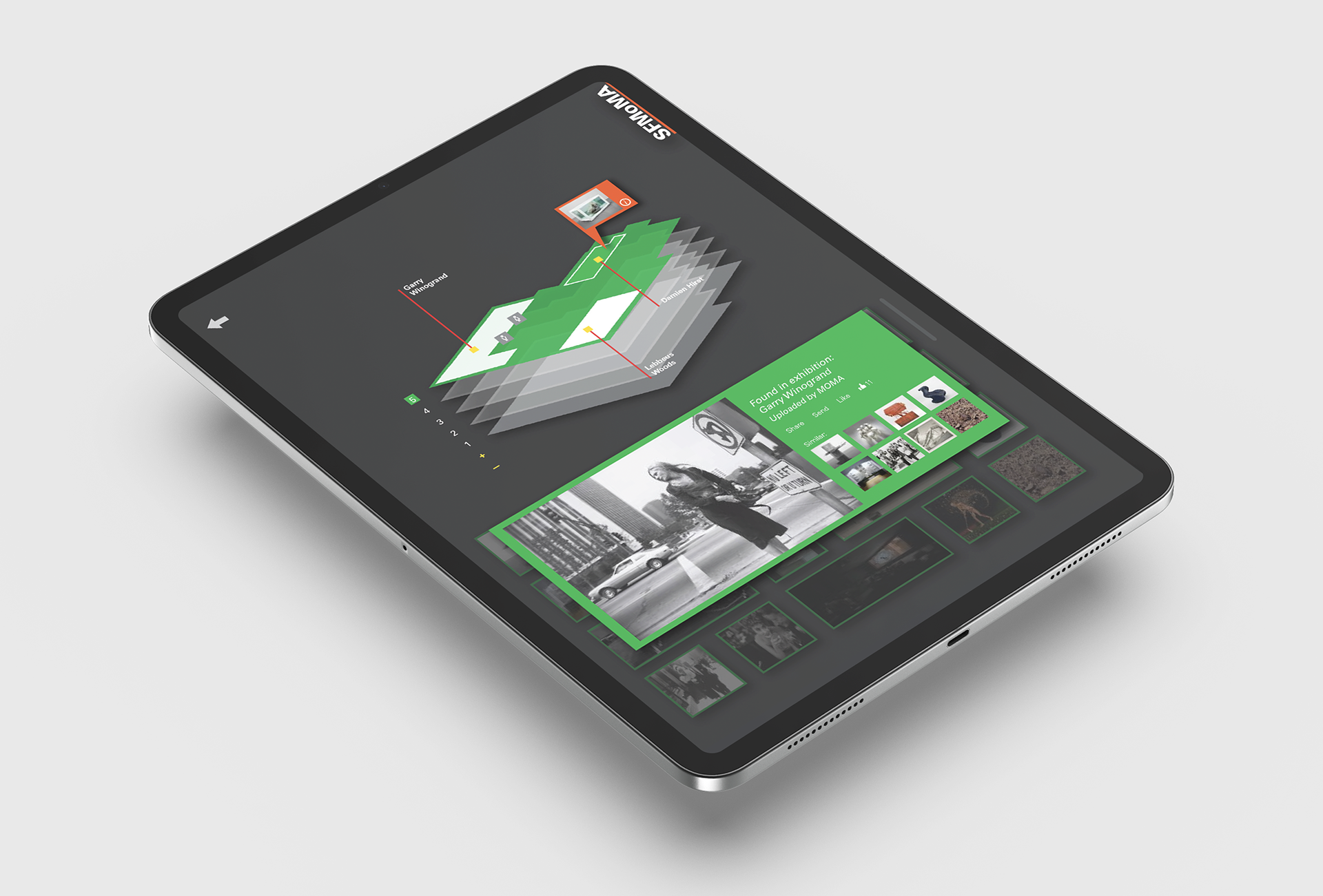
Interactive Maps & Smart GPS: Designed a visual navigation system using abstracted floor plans, helping users find exhibits, rest areas, or friends with ease.
Custom Tour Builder: Let users create personalized journeys through the museum based on time, mood, or themes.
Exhibit Enhancers: Created designs for quick-scan QR or NFC moments that revealed stories, artist interviews, or behind-the-scenes videos using stylized card layouts.
Social Features: Designed a “friend finder” interface and digital badges that encouraged shared exploration and playful interaction.
Kiosk Companion: Extended the app’s visual system to kiosks, with touch-friendly layouts, accessible type sizes, and engaging prompts for group use.
VISUAL DESIGN & CONSISTENCY
To ensure brand alignment and clarity, we established a cohesive identity system across platforms. This included a custom icon set, a modular type system, responsive grid structures, and micro-interactions that added delight without distracting. Color use was intentional: soft neutrals for focus areas, high-contrast accents for calls to action.
To ensure brand alignment and clarity, we established a cohesive identity system across platforms. This included a custom icon set, a modular type system, responsive grid structures, and micro-interactions that added delight without distracting. Color use was intentional: soft neutrals for focus areas, high-contrast accents for calls to action.
IMPACT
The final design turned traditional museum visits into interactive journeys, encouraging deeper engagement with exhibits through features like GPS-enabled navigation, custom tours, and playful social elements. Visitors could explore with confidence, connect with friends, and personalize their experience, leading to longer visits and greater overall satisfaction. The cohesive, intuitive design system across mobile, tablet, and kiosk platforms reflected SFMoMA’s innovative spirit and commitment to accessibility. By blending thoughtful UX with modern visual design, the app helped the museum foster connection, learning, and a lasting sense of discovery among its diverse audience.