CRAFTING AN IDENTITY TO HONOR TRADITION & MODERNITY
Ramen Story, located on San Francisco’s bustling Embarcadero, offers diners a unique experience that blends authentic Japanese noodle-making traditions with contemporary dining culture. The goal was to develop a brand identity that embodies the craftsmanship of hand-pulled noodles and the elegance of traditional Japanese aesthetics, while appealing to a modern urban audience.
RESEARCH & INSPIRATION
To root the design in authenticity, I researched traditional Japanese calligraphy and sumi-e (ink wash) art, focusing on their fluid lines, organic textures, and minimalist elegance. These elements perfectly reflected the noodle-making process—its rhythmic flow and handcrafted nature. This research guided the creation of a visual system that feels both timeless and dynamic.
To root the design in authenticity, I researched traditional Japanese calligraphy and sumi-e (ink wash) art, focusing on their fluid lines, organic textures, and minimalist elegance. These elements perfectly reflected the noodle-making process—its rhythmic flow and handcrafted nature. This research guided the creation of a visual system that feels both timeless and dynamic.
DESIGN DEVELOPMENT
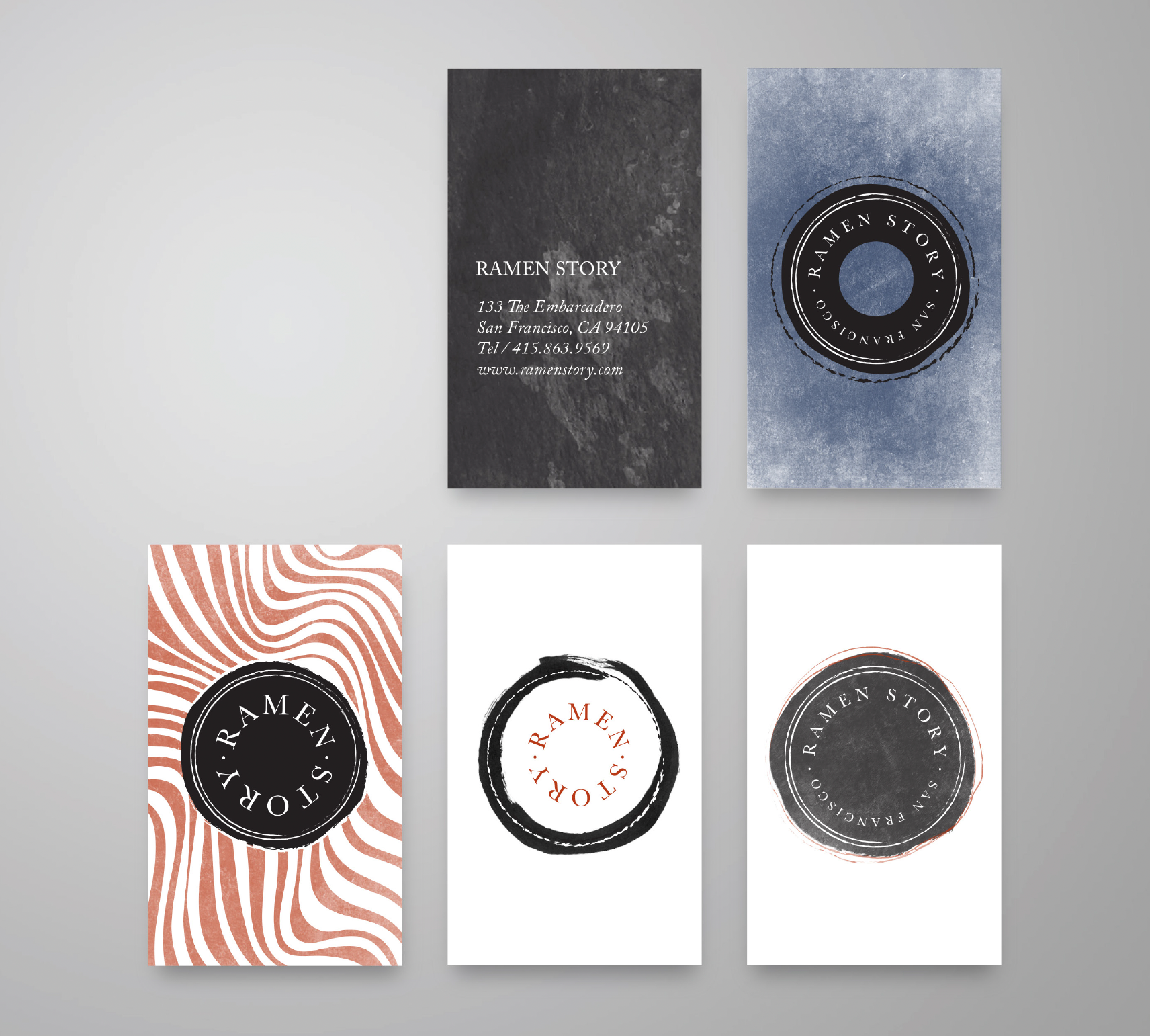
Logo Variations: Multiple logo options were crafted to provide flexibility across different brand touchpoints—from signage to menus and packaging—while maintaining visual cohesion. Each variation incorporates brushstroke-inspired forms that evoke movement and craft.
Flowy Pattern: Inspired by the twisting, pulling motion of noodles, a dynamic, flowing pattern was developed to add depth and texture to backgrounds and collateral, creating a sense of rhythm and continuity.
Typography & Color: Complementary typography was selected for clarity and balance, pairing traditional serif or sans-serif fonts with the expressive brush style of the logo. A muted, earthy color palette—blacks, greys, soft reds—further ties the brand to Japanese art and cuisine traditions.
APPLICATIONS
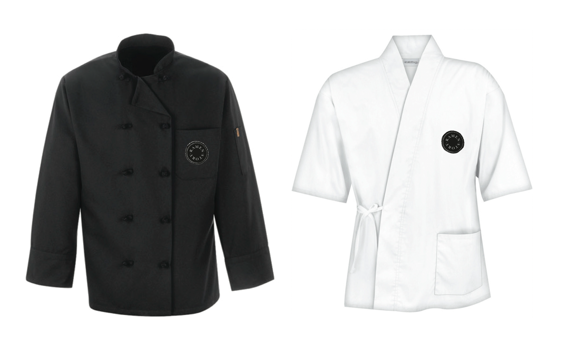
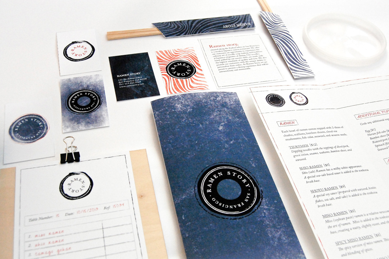
The branding extends across business cards, menus, packaging, staff uniforms, and digital assets, all designed to provide a consistent and immersive brand experience. The tactile quality of printed materials echoes the handcrafted nature of the food, reinforcing the brand’s values through touch and feel.
The branding extends across business cards, menus, packaging, staff uniforms, and digital assets, all designed to provide a consistent and immersive brand experience. The tactile quality of printed materials echoes the handcrafted nature of the food, reinforcing the brand’s values through touch and feel.
USER EXPERIENCE
Beyond visuals, the branding informs the customer experience—signage and packaging are intuitive and inviting, supporting a welcoming atmosphere where diners can appreciate the cultural nuances of Japanese dining etiquette. The design subtly educates and immerses guests, deepening their connection to the food and tradition.
Beyond visuals, the branding informs the customer experience—signage and packaging are intuitive and inviting, supporting a welcoming atmosphere where diners can appreciate the cultural nuances of Japanese dining etiquette. The design subtly educates and immerses guests, deepening their connection to the food and tradition.
IMPACT
The cohesive and thoughtful branding has helped Ramen Story carve a distinct identity in a competitive market. Customers recognize the authenticity and care behind the brand, enhancing loyalty and word-of-mouth referrals. The identity’s balance of tradition and modernity supports the restaurant’s mission to celebrate culinary heritage while engaging a diverse, contemporary audience.
The cohesive and thoughtful branding has helped Ramen Story carve a distinct identity in a competitive market. Customers recognize the authenticity and care behind the brand, enhancing loyalty and word-of-mouth referrals. The identity’s balance of tradition and modernity supports the restaurant’s mission to celebrate culinary heritage while engaging a diverse, contemporary audience.