DESIGNING & ENHANCING THE VISIT
Client: California State Parks (Conceptual Rebrand Project)
Role: Brand Designer
Role: Brand Designer
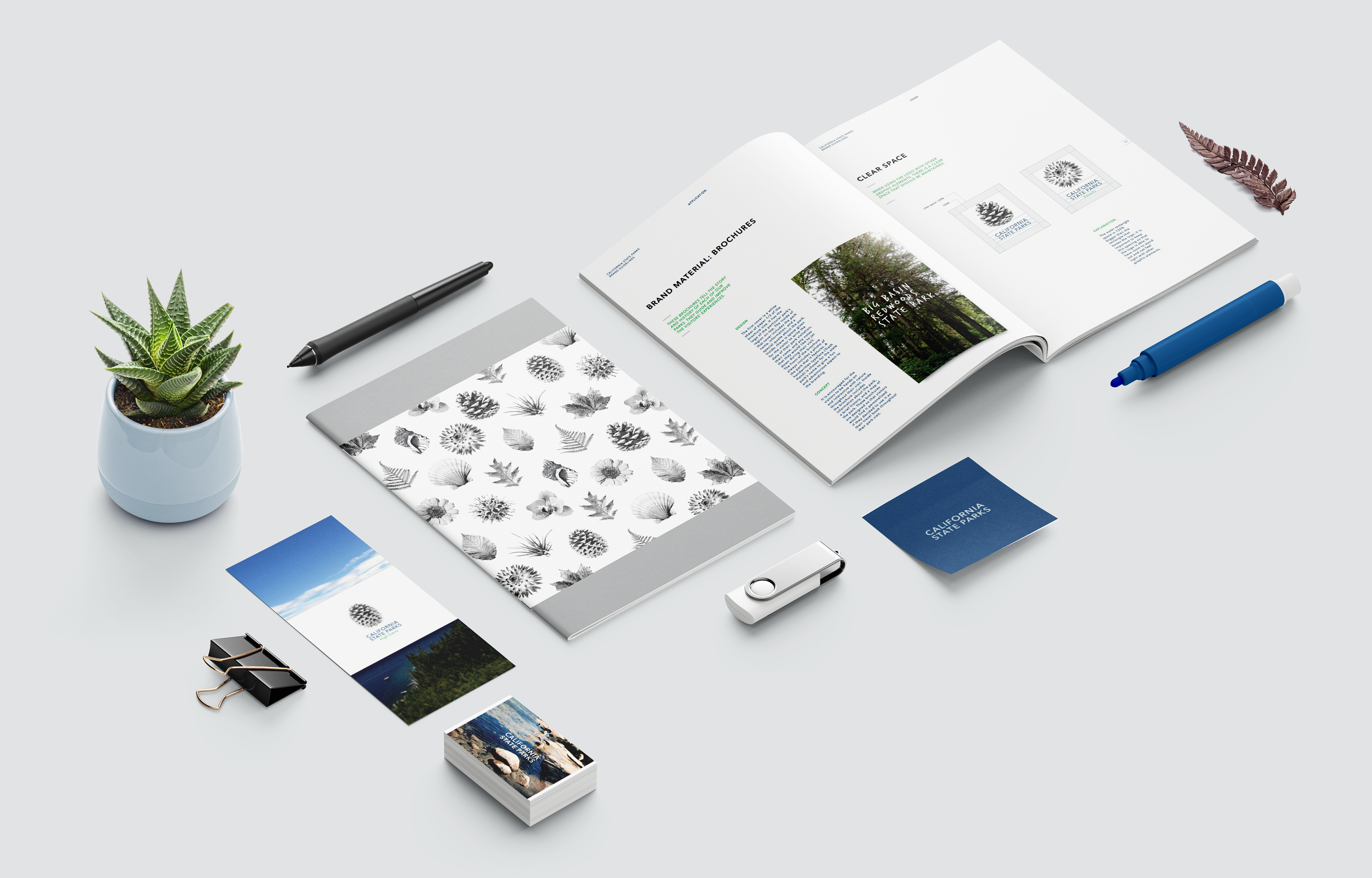
This project involved a full rebrand of the California State Parks system—one of the largest and most diverse park networks in the nation. The goal was to refresh the brand’s identity to better reflect the spirit of exploration, connection to nature, and the cultural richness found across California’s parks. The redesign included a comprehensive visual identity system, communication strategy, website, and a robust style guide to ensure consistency across all touchpoints.
DESIGN STRATEGY
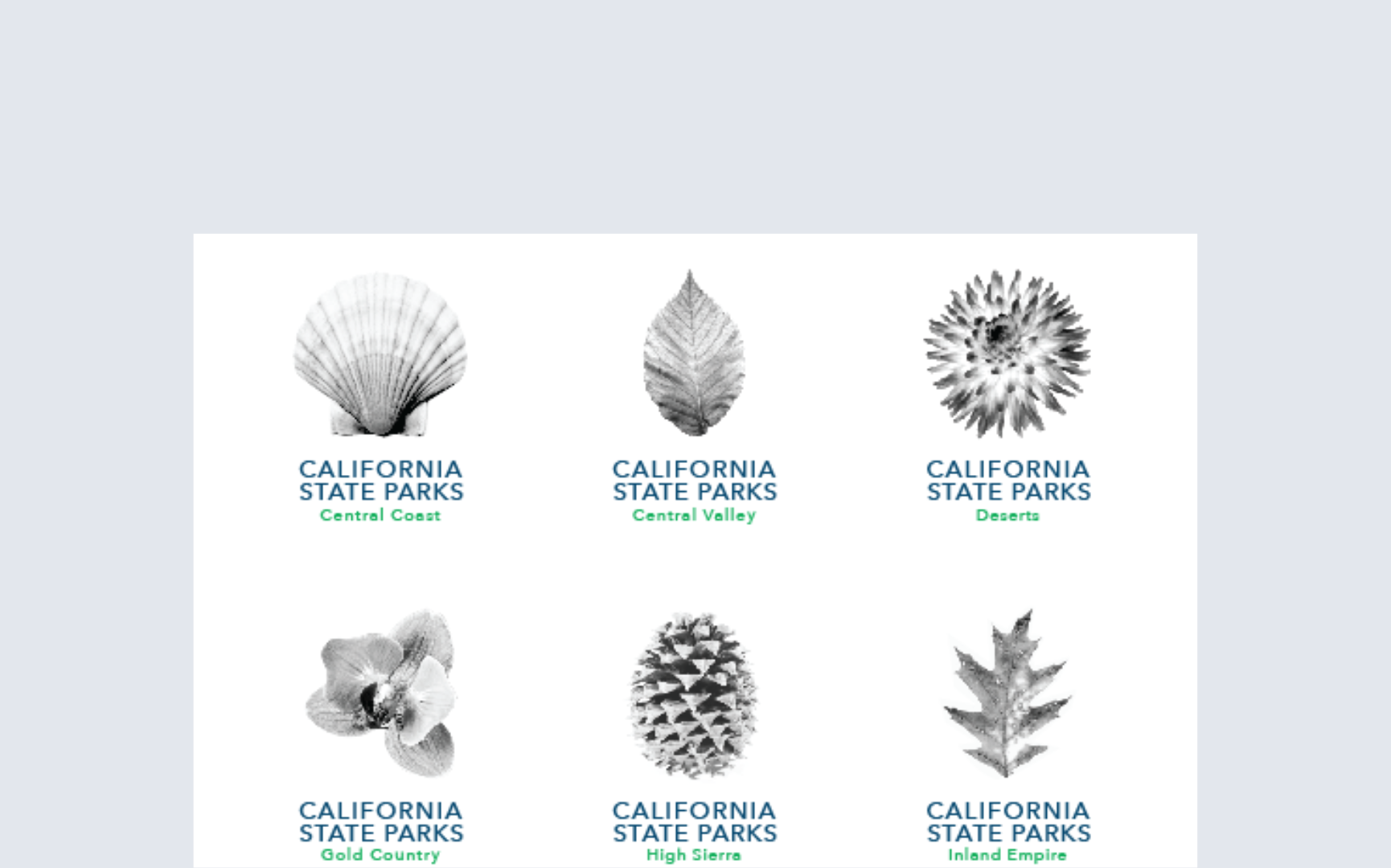
The approach was grounded in research and strategic insight. We began by analyzing user perceptions, existing brand gaps, and inconsistencies in visual communication. The strategy focused on three key pillars: accessibility, emotional connection, and visual cohesion. From there, we developed a flexible brand architecture that could scale across more than 280 park sites—each with its own story, but unified under a shared identity.
The approach was grounded in research and strategic insight. We began by analyzing user perceptions, existing brand gaps, and inconsistencies in visual communication. The strategy focused on three key pillars: accessibility, emotional connection, and visual cohesion. From there, we developed a flexible brand architecture that could scale across more than 280 park sites—each with its own story, but unified under a shared identity.
VISUAL SYSTEM
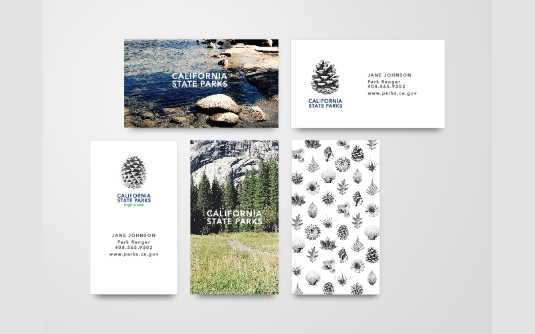
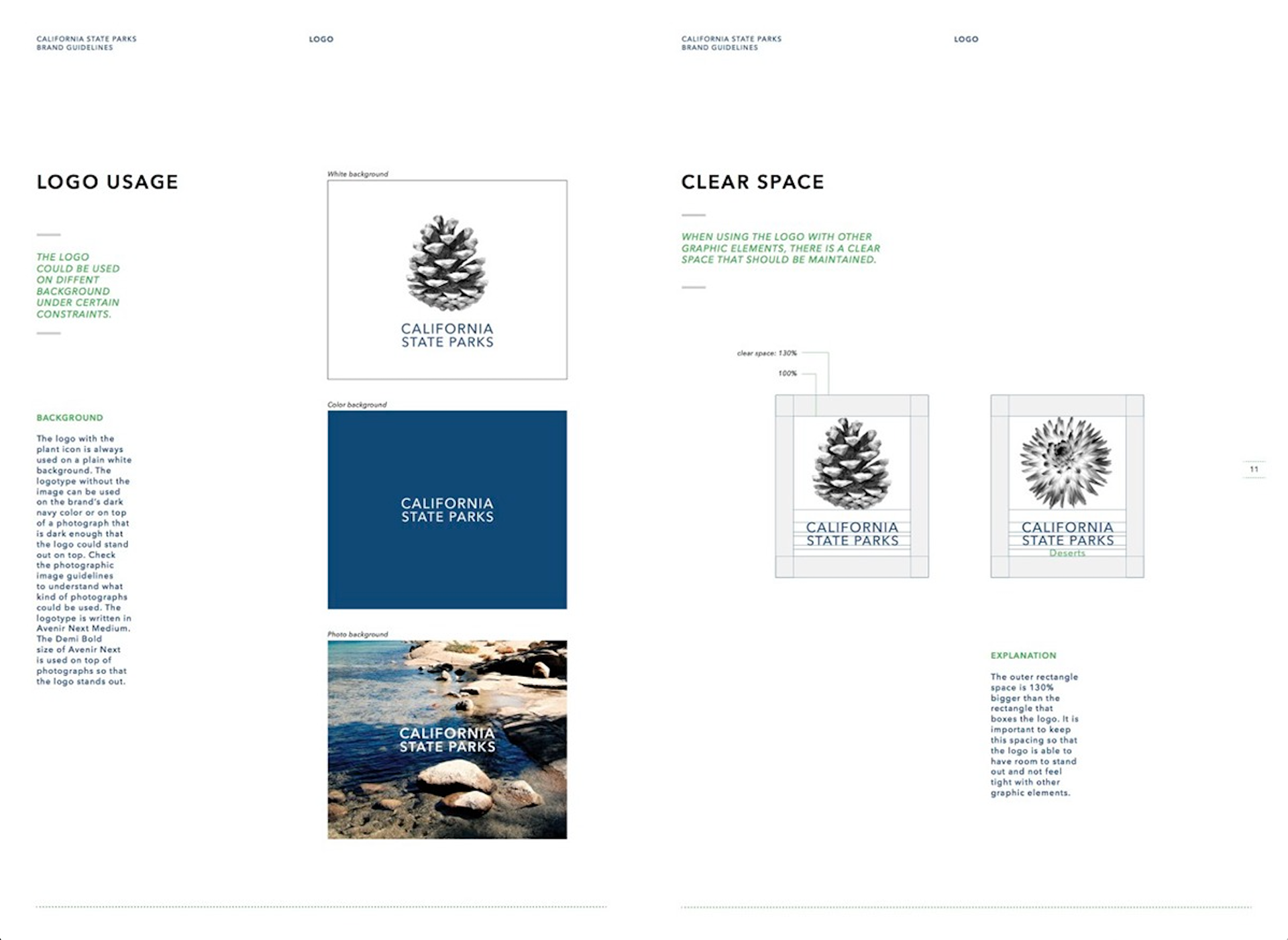
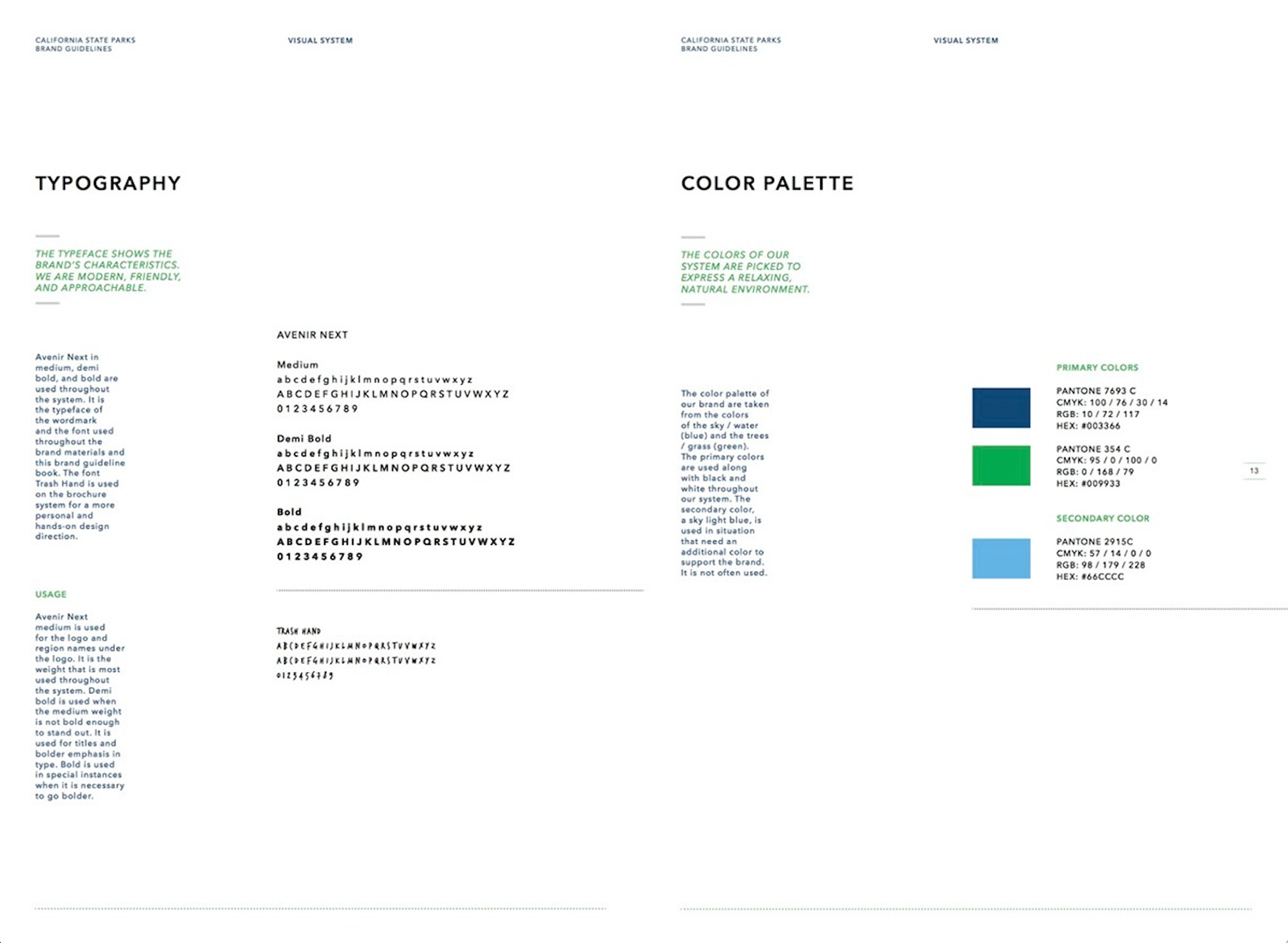
A hand-drawn illustration style was introduced to evoke a sense of warmth, nostalgia, and personal connection—complemented by bold, vibrant photography that celebrates the parks’ natural beauty and diverse visitors. The main logo and 12 distinctive brand extensions reflect the individuality of each region while staying aligned through a minimal, modern design system. Typography and color palettes were chosen to feel natural, contemporary, and easily legible across print and digital.
A hand-drawn illustration style was introduced to evoke a sense of warmth, nostalgia, and personal connection—complemented by bold, vibrant photography that celebrates the parks’ natural beauty and diverse visitors. The main logo and 12 distinctive brand extensions reflect the individuality of each region while staying aligned through a minimal, modern design system. Typography and color palettes were chosen to feel natural, contemporary, and easily legible across print and digital.
EXECUTION
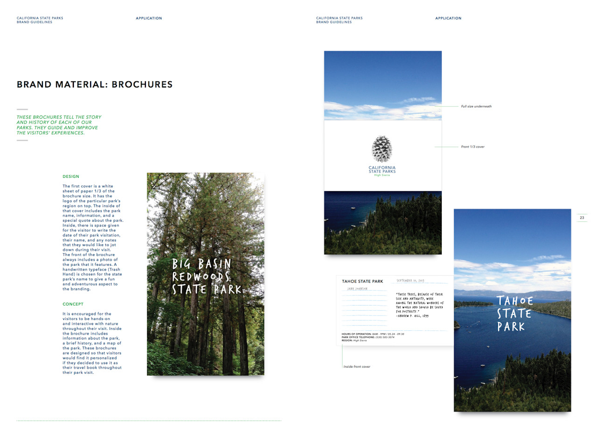
Assets created included the primary logo, sub-brand logos, wayfinding mockups, park brochures, merchandise applications, a responsive website concept, and a digital brand guide. The entire system was designed to feel unified yet adaptable, scalable for both high-traffic state park hubs and lesser-known sites.
Assets created included the primary logo, sub-brand logos, wayfinding mockups, park brochures, merchandise applications, a responsive website concept, and a digital brand guide. The entire system was designed to feel unified yet adaptable, scalable for both high-traffic state park hubs and lesser-known sites.
IMPACT
The new identity positions California State Parks as more than just a destination—it becomes a welcoming invitation to explore, learn, and belong. By creating a consistent and emotionally resonant visual system, the rebrand enhances visitor experience, supports education and stewardship, and builds lasting affinity with a new generation of explorers. The brand now communicates its mission with clarity, warmth, and lasting impact.
The new identity positions California State Parks as more than just a destination—it becomes a welcoming invitation to explore, learn, and belong. By creating a consistent and emotionally resonant visual system, the rebrand enhances visitor experience, supports education and stewardship, and builds lasting affinity with a new generation of explorers. The brand now communicates its mission with clarity, warmth, and lasting impact.