
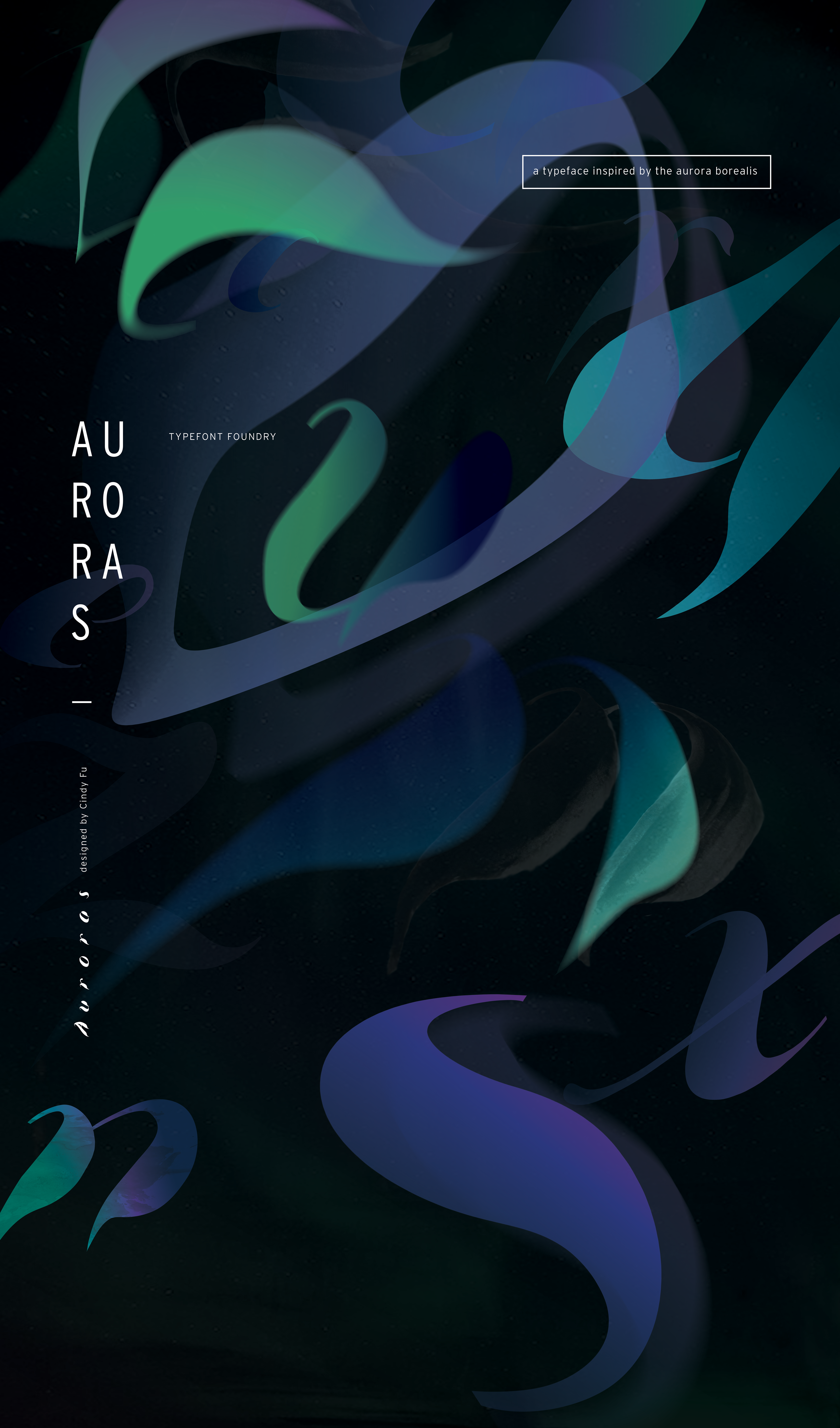
CAPTURING THE ESSENCE
Auroras is a display typeface inspired by the dynamic movement and luminous beauty of the Aurora Borealis. This typeface captures the essence of nature’s most ethereal light show through expressive forms, bold contrast, and organic rhythm.
DESIGN STRATEGY
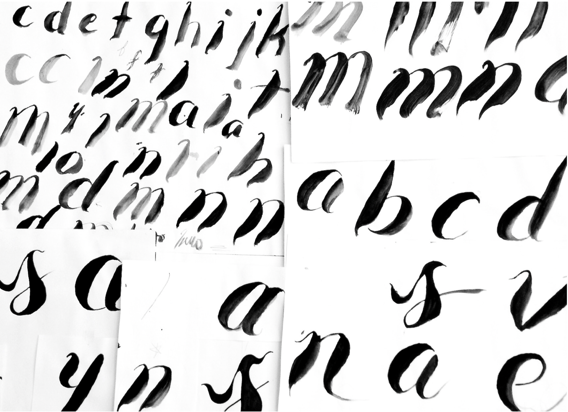
To translate the feeling of the auroras into letterforms, I began with hands-on experimentation—using brush and ink to explore flowing, calligraphic shapes that embodied movement and light. These organic sketches laid the groundwork for the typeface’s dramatic italic slant and high-contrast strokes. Each letterform was refined digitally to maintain consistency while preserving the expressive character of the original marks.
To translate the feeling of the auroras into letterforms, I began with hands-on experimentation—using brush and ink to explore flowing, calligraphic shapes that embodied movement and light. These organic sketches laid the groundwork for the typeface’s dramatic italic slant and high-contrast strokes. Each letterform was refined digitally to maintain consistency while preserving the expressive character of the original marks.
EXECUTION
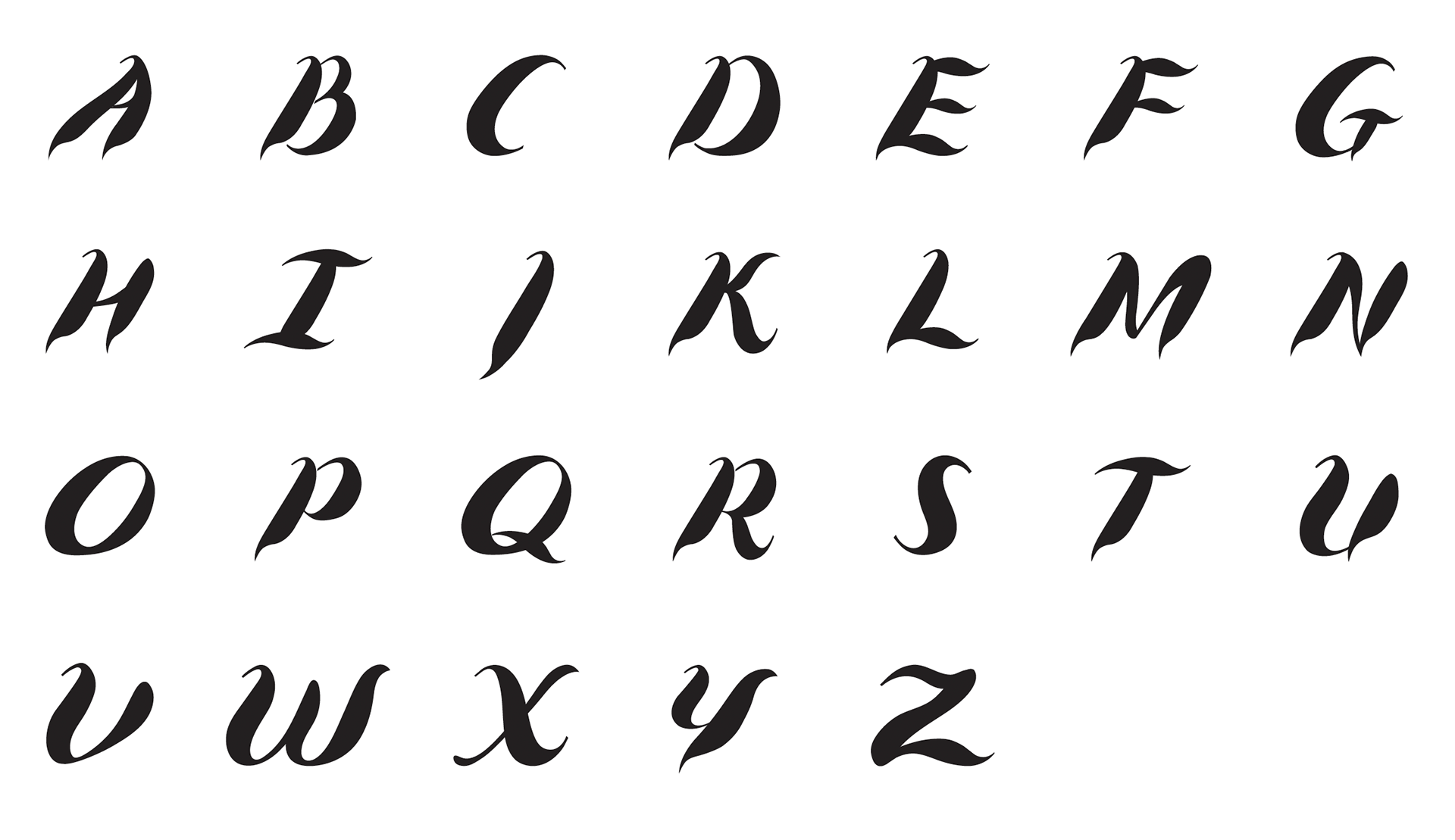
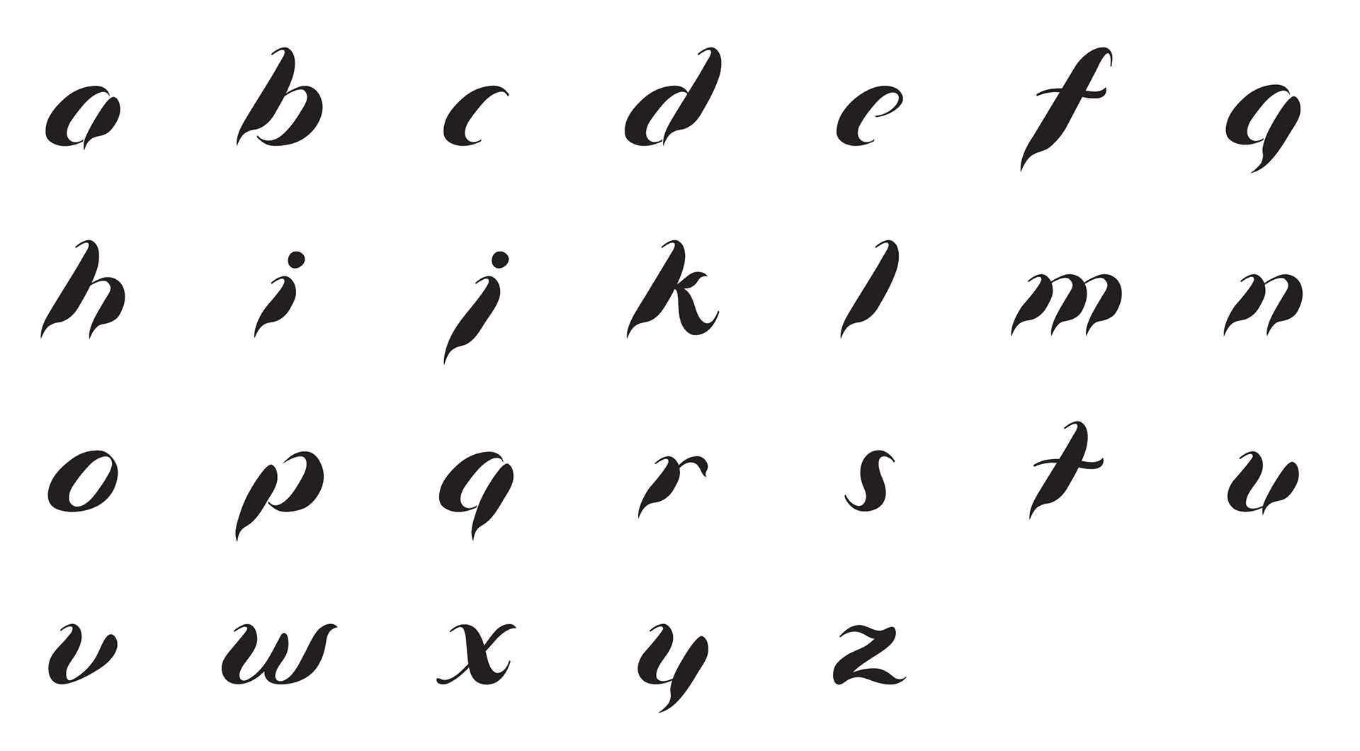
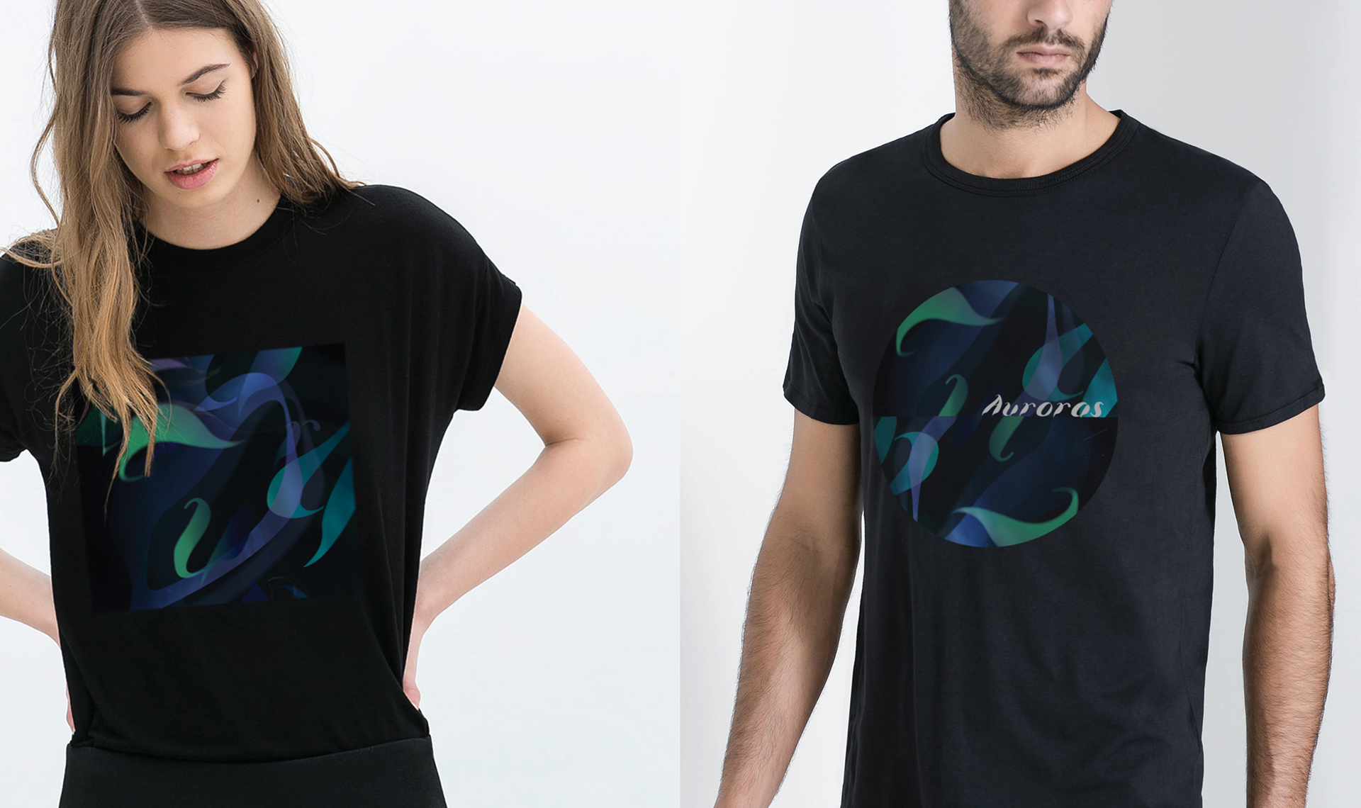
The final typeface features pointed terminals, sweeping curves, and visual weight shifts that echo the shifting glow of the auroras. Gradients of green, blue, and violet were selectively applied in display settings to further evoke the atmospheric light phenomenon. The typeface was tested and shown across a range of applications—from editorial layouts to event posters and digital promotions—demonstrating its versatility as a bold, expressive headline font.
The final typeface features pointed terminals, sweeping curves, and visual weight shifts that echo the shifting glow of the auroras. Gradients of green, blue, and violet were selectively applied in display settings to further evoke the atmospheric light phenomenon. The typeface was tested and shown across a range of applications—from editorial layouts to event posters and digital promotions—demonstrating its versatility as a bold, expressive headline font.
IMPACT
Auroras brings visual poetry to typography. It serves as both a functional typeface and an artistic homage to one of nature’s most awe-inspiring phenomena. The typeface invites viewers into a story of motion, contrast, and light—making it an ideal choice for expressive brand moments or visually rich design work.
Auroras brings visual poetry to typography. It serves as both a functional typeface and an artistic homage to one of nature’s most awe-inspiring phenomena. The typeface invites viewers into a story of motion, contrast, and light—making it an ideal choice for expressive brand moments or visually rich design work.
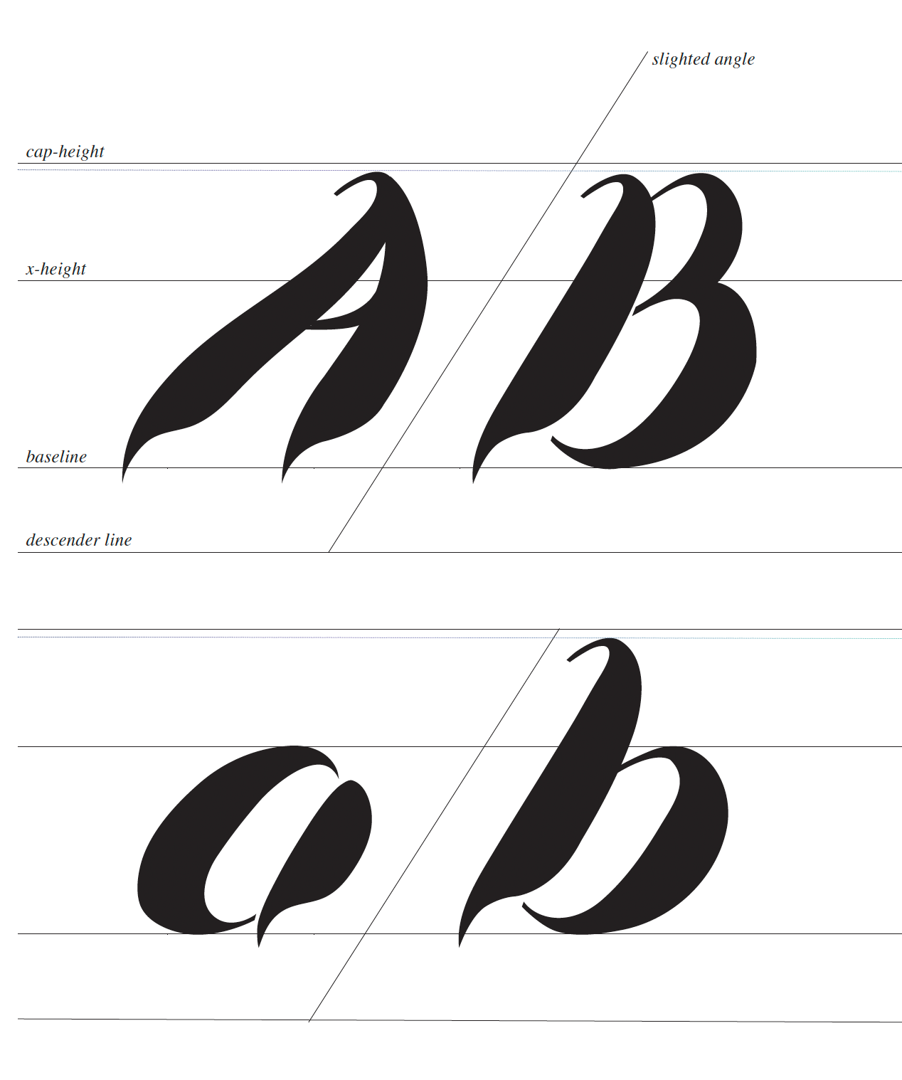
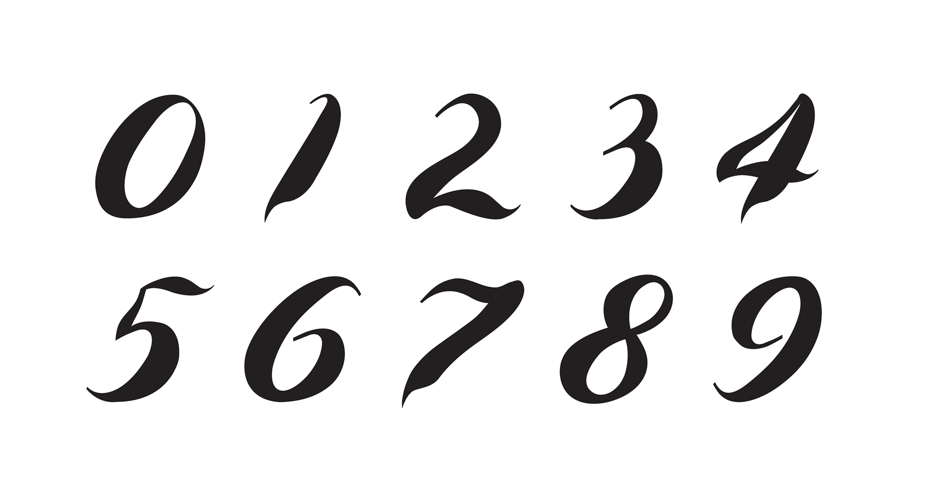
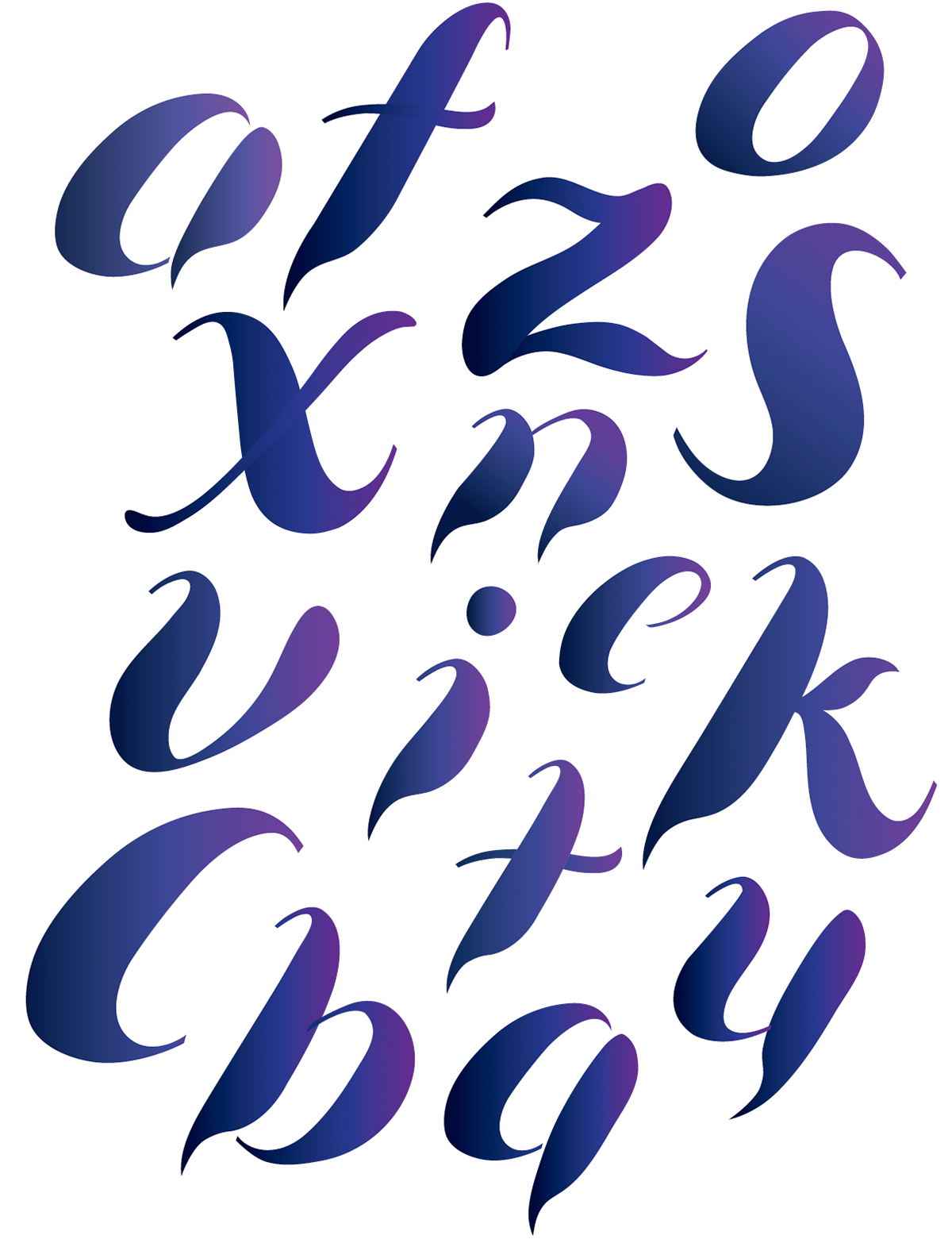
Grid System & Type Anatomy
The Auroras typeface was constructed on a traditional typographic grid, aligned to cap-height, x-height, baseline, and descender lines to ensure structural consistency. While grounded in this classic system, the typeface introduces distinctive features that reflect its conceptual inspiration. Letterforms feature a strong italic slant and bold vertical movement, with downward strokes often extending slightly below the baseline to enhance a sense of flow and energy. Pointed terminals on straight downstrokes evoke the sharpness of aurora peaks, while carefully maintained stroke weight and curve consistency unify the letterforms. These anatomical decisions help communicate the elegant, shifting quality of the Northern Lights while maintaining readability and visual harmony.
The Auroras typeface was constructed on a traditional typographic grid, aligned to cap-height, x-height, baseline, and descender lines to ensure structural consistency. While grounded in this classic system, the typeface introduces distinctive features that reflect its conceptual inspiration. Letterforms feature a strong italic slant and bold vertical movement, with downward strokes often extending slightly below the baseline to enhance a sense of flow and energy. Pointed terminals on straight downstrokes evoke the sharpness of aurora peaks, while carefully maintained stroke weight and curve consistency unify the letterforms. These anatomical decisions help communicate the elegant, shifting quality of the Northern Lights while maintaining readability and visual harmony.


Auroras Type Book 3D Animated Cover